Flexible Images
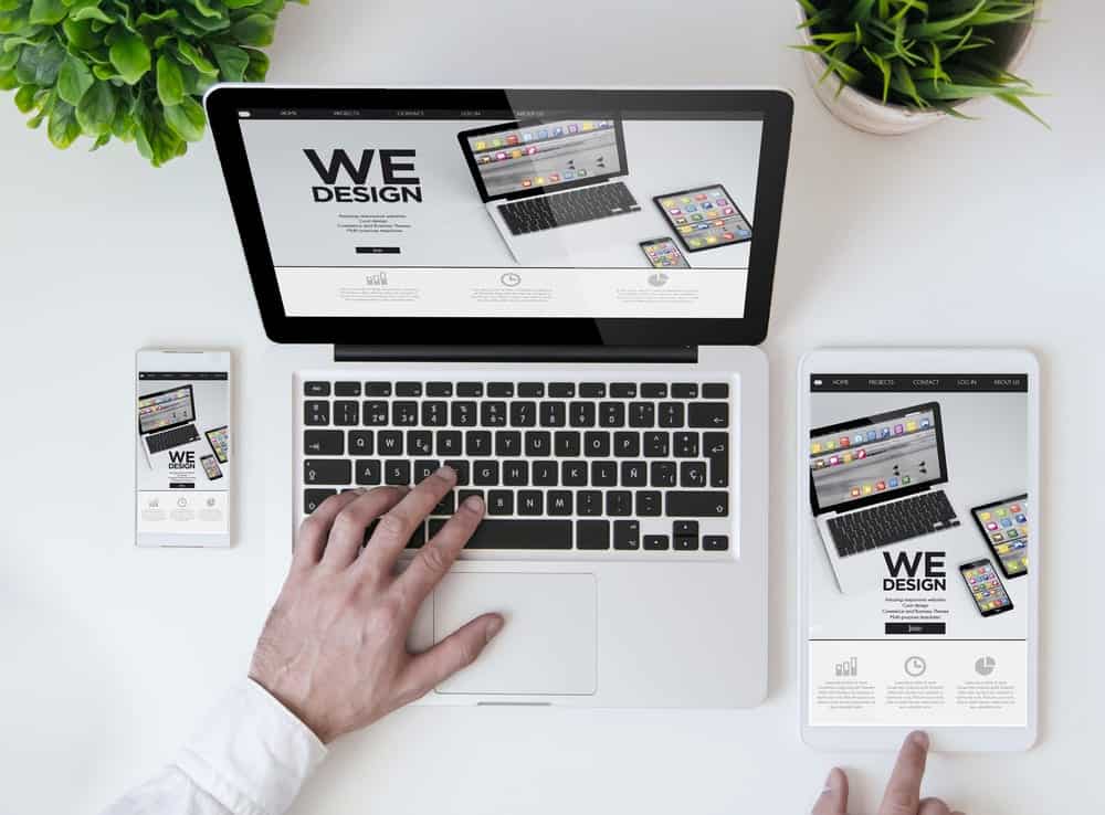
Images can be a problem if they are not resized proportionally. They can interfere with a website’s layout, so we can make them automatically resizable. A way of doing this is to set the max width to 100%. This means that when the screen size changes, so does the image. Such as when a device has a narrower screen size, the image will become more narrow to fit the screen. The idea of flexible images is when you set images at the maximum size that they are going to be used at, the browser will then resize the images. This is done while using css will then display the image at its relative size. This simply resizes images to fit the device’s screen size.
Custom Layout Structure
When a website has large size changes between devices, the layout may have to be changed altogether. This can be done through a separate stylesheet or a css media query. An example of this could be if a group of people were to work on and create a website. If one were to work on the header of the page, and someone else works on the body then it would be suitable to set up separate stylesheets. Each user can comment the code they have written, so that each other person working on the site can see and understand what they have done. To do this you start the comment with /* and end it with *\.
Showing Or Hiding Content
Sometimes it is not the best solution to display all of the content on a page, depending on the device. For example, a phone screen has a much smaller screen size than a tablet, so some content can be hidden that is not necessary to see all of the time. This could be an image that is not seen unless switching orientation to landscape. Another example would be a button that is visible on a mobile device but not on desktop.
