Features of a Good PPC Landing Page
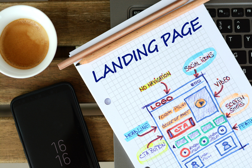
In the world of search marketing, a good landing page is the most powerful tool in any marketer’s inventory. Simply getting qualified leads to click on your Google Advert isn’t enough if your landing page can’t get them to convert.
In this blog, the team at Blue Whale Media will be highlighting some useful tactics to use and examples of good landing pages for PPC marketing.
Descriptive & eye catching call to actions
The first thing is one of the most obvious, but also one of the hardest to pull off. Your landing page needs to have clear and effective call to actions.
Before you start to think about the content or even the layout of your landing page, you need to understand your objectives. What is this landing page trying to achieve? Do you want people to email or call your business? Do you want people to submit a contact form? Do you want people to purchase a product?
When you understand the objective of your landing page, only then can you start to think about actually creating it and what elements your landing page needs
For example, if you’re looking for contact form submissions, you may incorporate a sticky contact form which remains visible at all times while the user navigates your landing page.
If you’re looking to sell a product, you’ll be looking to highlight the unique selling points: if you sell the product cheaper than your competitors then you need to find a way to highlight the price and perhaps even compare the price to competitors.
Incorporating call to actions isn’t just spamming a “BUY NOW” button all across your page. It’s all about highlighting the key details in the right moments, whilst giving customers the easiest method to convert.
Effective content
In conjunction with call to actions, it’s important to think about the content of your landing page. The type and amount of content required on your landing page will differ based on your objectives, target audience and industry.
For example, if you’re selling a well known product such as an iPhone, you don’t exactly have to go into detail on every aspect of the product, how to use it etc. Just small details such as the storage capacity, network, condition and colour of the phone would be necessary because most customers are only interested in these details.
On the other hand, if you’re selling a business service you would most likely have to go into more detail about the service itself, details of your own business as well as actually explain why the client should choose you over competitors.
Limit exit links
A rarely used tactic of landing pages is to limit the number of exit links on your landing page – or in some cases have no exit links at all.
An exit link is any hyperlink on the page which would take the user to another page, or even another website. The whole point of a landing page is to build a page completely dedicated to converting a user – if you are providing ways for the user to easily leave your landing page then you are just hurting your own chances of conversion. The only time a landing page should include an exit link is if it is necessary for the customer journey, such as a link to a product page or contact us page etc.
Some ways of limiting the number of exit links include:
- Completely removing the navigation bar. Instead, replace it with contact buttons.
- Do not worry about internal links: this landing page is for PPC, so take off your SEO hard hat!
- Think before you link: if a page doesn’t have a clear place in the customer journey, it shouldn’t be linked from the landing page.
A great example of limiting exit links is Video Wizardz’s landing page. In this page, you’ll see the only exit links are for the Terms & Conditions and Privacy Policy pages. Every single call to action keeps the user on the page, contact forms & live chat are pop ups and you can call or email them without leaving the page.
Draw attention with white space
You don’t need to use 6 arrows pointing to your call to action to make it noticeable. Correctly using white space is a fantastic method of drawing attention to your most important elements. Despite the name, white space doesn’t actually have to be white.
Using Video Wizardz’s landing page as an example again, the white space around the contact form at the top of the page is a great way of showcasing this tactic.
As soon as the page loads, you notice how the above-fold display is split in half. The left side is filled with content and visuals including the main title, a highlighted price point, two call to actions and three images to showcase their credibility. Despite this, your eyes will naturally be drawn to the right side of the fold: the only thing here is a contact form. The use of white space contrasting with the amount of content on the left side of the page immediately captures your attention, especially due to the bright orange background colour behind the contact form.
The usage of the bright orange colour is particularly important to note. If you scroll through the page, we can clearly see that the designer has opted to use the same red colour whenever they want to highlight a specific point, price or call to action. As we scroll through the page, this red colour loses its eye-catching impact because it’s being used too much so it will start to blend in with the overall design.
You may notice that this red colour was not used to divert your attention to the contact form. In fact, the contact form is the ONLY element on the page with an orange colour. Because it is so unique and the colour was so striking in the first place, the user will always remember that the contact form is at the top of the page, whereas they may simply scroll past the other call to actions because the choice of red no longer stands out to them.


