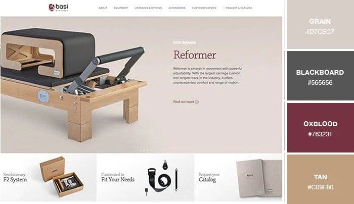
Colour Palettes: Neutral colours
From the clothes we wear to the trinkets we buy, colours evoke different feelings and emotions that influence consumers everyday decisions.
When used correctly, colour can be one of the single most important aspects of website design – so getting the palette right at the start of the project is essential.
Not only can colour help make a website more memorable, it can also make the user experience more enjoyable resulting in higher conversion rates.
Neutral colour palette
Neutral Colours include white, black, gray and colours that contain a large amount of gray. Neutral colours are great for back-grounds and for enhancing the effect of warm colours.
It’ll be more effective if you limit the amount of colours within a colour palette and use shade variations, as it is visually more appealing. The function of neutral colours in modern web design is much like that of white space – to give users a break and allow them time to better digest and prioritise information on the page. It’s a good idea to have one dark and one light neutral colour for different uses across your website pages.
What are Neutral Colours?
Neutral colours, like white, black, gray, brown, and cream, typically work as the design backdrop. They are often merged with more vibrant accent colours. However, they’re flexible enough to be used on their own creating chic and elegant layouts.
There should be high colour contrast between the font colour and the background colour on your website. You can never go wrong with the classic dark on light combination or vice-versa.
Does colour choice really matter?
The importance of colour design stems from the significance of colour to the human mind. Colour creates ideas, expresses messages, sparks interest, and generates certain emotions. Bright colours tend to set a happy and positive mood, whereas dark colours tend to project the opposite. Within the psychology of colours, warm colours show excitement, optimism, and creativity; cool colours symbolise peace, calmness, and harmony. By considering colour combinations you can see what colours symbolise and how they are evaluated internally and emotionally.
Know your audience
Cater to your target audience. Factors that need to be taken into consideration include demographics (age, gender, industry, location, etc.)
Choosing the right website colour scheme is what makes it memorable, trustworthy, attractive, and profitable. The first impression is everything. In a 2012 study, nearly 2,000 men and women were asked whether they preferred purple, blue, green, yellow, orange, red, or pink. 42% of men said blue was their favorite colour, followed by green (25%) and purple (12%). Women also said blue was their preferred colour (29%), followed closely by purple (27%) and green (19%).
Which Industries Favor Different Colours?
Colour is one of the most important elements of a memorable brand – alongside typography, brand name, and graphics.
So it’s not at all surprising to learn that different industries favour different colours, as they’re trying to evoke particular emotions and create industry-relevant associations.
Neutral colours will most likely be used for text and background, but they come in handy with colourful sections of the site, just to help tone it down and refocus the eye.
Working with colour can be very complex as there are many variables to take into account when designing websites. Colour in web design is clear: when used creatively it can really make a difference to the user experience and ultimately the conversion rate.


