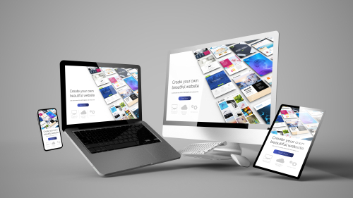
Principles of responsive web design
Responsive web design is important to ensure a website works across devices of all sizes. Responsive web design is becoming more and more important as more people use their phones or tablets to access websites. It is now common practice to build responsive websites instead of building websites for set screen sizes.
Relative Units
If a website is built first for a desktop it can be useful to use relative units instead of absolute units. Relative units such as percentage or vh (viewport height) are flexible and so work the same across multiple different screen sizes whereas absolute units such as pixels can look fine on a large screen but might be too big to fit on a smaller screen. Using relative units makes it much easier to make a website responsive.
Media Queries
Media queries change the layout of the website when the screen size is below the size specified in the media query. Media queries can be used to change things like font sizes or image sizes when the screen is too small. This helps to prevent text being too large to read properly on small screens. Media queries can also be used to create breakpoints.
Breakpoints
Breakpoints change to the layout of a website when the size of the screen goes below a specified size. They could be used to separate 4 different items on one row on a desktop computer into two different rows on a mobile phone screen.


