Travel & Tourism Colour Schemes within Web Design
Colour is such a fundamental part of the way we perceive the world that we often take it for granted. As professional designers, we understand the importance of using the correct colours – whether it’s for marketing or even a web design in Manchester.
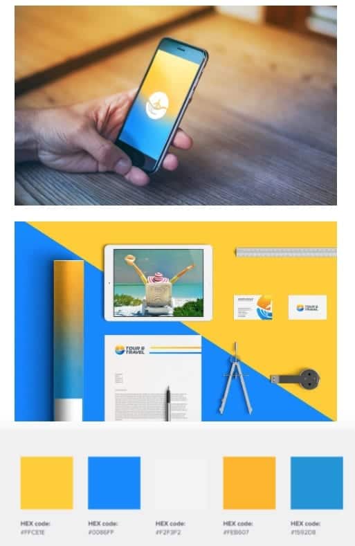
Vivid impressions are what every person on vacation is seeking. That’s why within the travel industry, the aim is to amaze consumers online and create a colour palette that conveys brightness straight to a visitor.
This is why one of the most powerful tools in a designer’s arsenal is colour. It can either make or break a design; it can be the determining factor when engaging online viewers.
Travel and Tourism Colour Scheme
There are specific colours that are universally liked across the board. They can be great for building brand loyalty and positive brand sentiment, which will help you close more business down the line.
Yellow: The colour of sunshine, yellow is associated with happiness and joy, which is what most customers experience when booking or researching a holiday. Super cheerful and accessible, it is ideally what you want your audience to feel.
Blue: The most versatile and universally liked. Blue has been shown to inspire feelings of trust, making it a heavy favourite among brands. This is also another factor you want to achieve if you’re a business within the Travel and Tourism sector, you want customers to trust you, but also get excited. Excitement = good business.
Colour Schemes that Increase Brand Sentiment
Some colours can be easily incorporated into any website as they are universally liked across the board. A light blue colour palette or a navy blue colour palette are some of the examples of colours that are appealing to all generations and audiences. Some companies choose to match customer expectations by using their industry’s common colours; others have found that going against the grain is an effective way to make an impression.
Contrast in colours
Every shade of colour has a set opposite — an “arch-nemesis.” You can use the colour wheel to do this, locate the colour on the opposite end of the circle.
Yellow is often a part of modern colour schemes and while it can be incorporated into almost any website, it is particularly appealing to younger audiences. It should be used as an accent colour to highlight certain elements and to add some personality to your website design.
Vibrancy of colours
Each colour evokes specific moods: the brighter warm colours (red, orange, yellow) tend to energise a user and make them more alert, while darker cool shades (green, blue, purple) tend to be more relaxing and tranquil. The contrast between the vivid blue background and yellow-orange accents immediately draws the eyes to the right places of a web page.
Website colour schemes that increase trust
Do you want to be viewed as a stable and trustworthy brand? Then use blue; it has been shown to increase feelings of trust and means your consumers can put their faith in you. That’s why it’s such a heavy favourite as over 53% of corporate logos feature the colour blue. Many business websites use blue because the colour naturally makes us think about things that are safe, secure, and comforting
Your website colour palette should not only reflect your brand but also appeal to your audience. When it comes to designing a website and creating maximum impact for your business, there’s more to the colour palette chosen than meets the eye


