10 Inspiring eCommerce Websites We Can Learn From
Creating an e-commerce website is no longer a hassle thanks to the many easy-to-use platforms like the Zyro website builder and others.
However, before building a website, make sure the design and components spark customers’ interest and deliver a flawless user experience. At the end of the day, despite the tools being simple, you still need to know how to apply them properly. This is where knowing e-commerce site best practices and recognising good examples come in handy.
The following list of the ten e-commerce websites should give you ample inspiration on how they put together awesome site functionality and design and what characteristics you can steal.
1. Apple
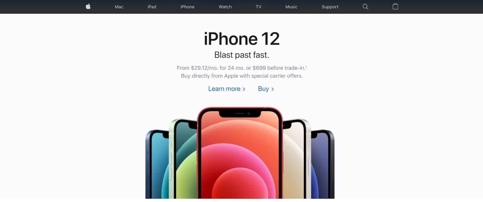
This tech giant is popular for their innovations in services, software, and hardware, which many businesses admire, and their e-commerce website is not an exception.
What you can learn:
- Less is more. With less clutter, Apple’s immaculate and modern design makes the site look organised and straightforward. It uses simple colours, graphics and typefaces and focuses on visually appealing photos.
- Varied font sizes. To get maximum scannability and certain emphasis even though the brand uses the same font.
Be brave in using negative space. To help visitors identify the focal point of the site.
2. Mahabis
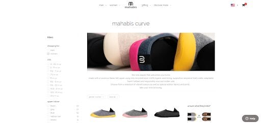
Mahabis is a premium-lifestyle brand making shoes and socks. The brand’s website uses dozens of compelling visuals to showcase the product, and it’s not the only reason why Mahabis’ website is inspiring.
What you can learn:
- An interactive graphic. Consists of a breakdown of the company’s shoes, telling the material origins and how it’s made. Interactive graphics can boost visitor engagement that results in higher search engine optimisation (SEO) ranking.
- Detailed filters and easy navigation. Help customers find products quickly.
- Comprehensive customer service information. The Help button at the bottom right of Mahabis’ site answers all FAQs from the brands’ shoe sizes to shipping methods and refunds.
3. Skullcandy
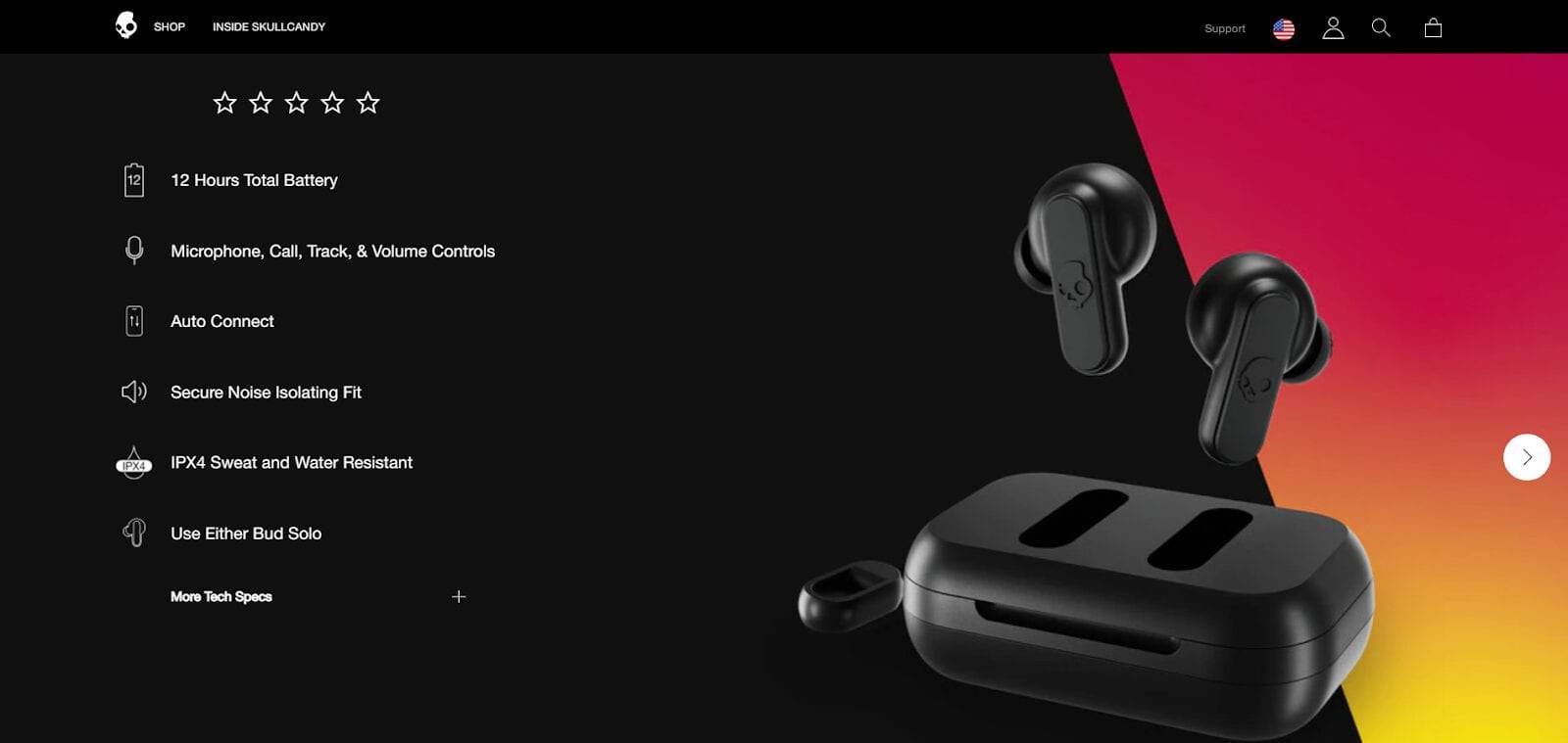
Skullcandy sells sound equipment like earbuds and speakers. Their website was honoured with the BigCommerce Best Category or Product Page Design Award in 2018, meaning it has a powerful recognition to be the top e-commerce site.
What you can learn:
- Incorporate various media. Including photos, infographics, and videos to deliver in-depth explanations of the products. For example, Skullcandy uses videos for the user guide and infographics to demonstrate the troubleshooting.
Well-written features and benefits. At first, the brand explains the features and benefits in a universally understandable way. Then, add More Tech Specs for further details.
4. Grovemade
This company sells wooden desk accessories, like laptop stands and pen cups. Grovemade’s website has an organised photo composition with great use of whitespace.
What you can learn:
- Behind the scenes of the brand. Grovemade shares the staff’s photos, company history, and physical store location. According to Statista, online shoppers love brands talking about their manufacturing process, as well as where it takes place and the people behind it.
Educational content. The brand creates a blog talking about materials and interviews with experts in the field. Blogging helps brands insert relevant keywords to get indexed by search engines and be perceived as the industry thought leader.
5. KITH
With one section on the homepage, KITH brings the visitors’ focus on their product categories. The photo on the page will change when your cursor is floating around a different category.
What you can learn:
- Lookbooks. Compared to catalogues, lookbooks make your products more flattering because they focus on visual storytelling and have no prices or other wordy details.
Currency localisations. Let users set a region and currency based on their location.
6. LARQ
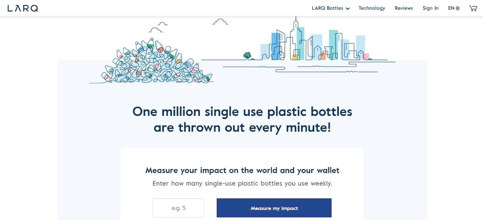
LARQ is an award-winning bottle using technology that neutralizes harmful bacteria. On the homepage, they display testimonials from famous media, including Forbes and Business Insider, and other aspects below will make you fall in love with this e-commerce website.
What you can learn:
- Interactive content. LARQ asks visitors to enter the number of plastic bottles they use weekly, and the brand will show infographics measuring the impact on the environment and how their bottles can reduce it.
Product comparisons. Help customers choose the best products that suit their needs.
7. Bliss
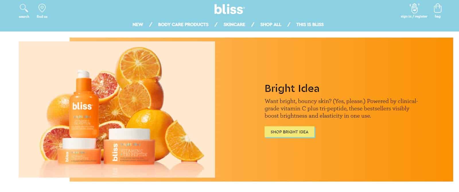
With the bright colours on the e-commerce website, the beauty brand delivers a cheerful and energetic personality. It also applies other important features below that can turn visitors into leads.
What you can learn:
- Relevant images and symbols. Represent the products’ ingredients that are free from cruelty and parabens. Visuals help people remember the information better than words do.
- Customer reviews. Are important as around 95 per cent of customers read reviews before purchasing products or services.
Lead magnets. Act as an incentive for potential buyers in exchange for their contact information. The incentive can be an e-book or discount like what Bliss offers.
8. Allbirds
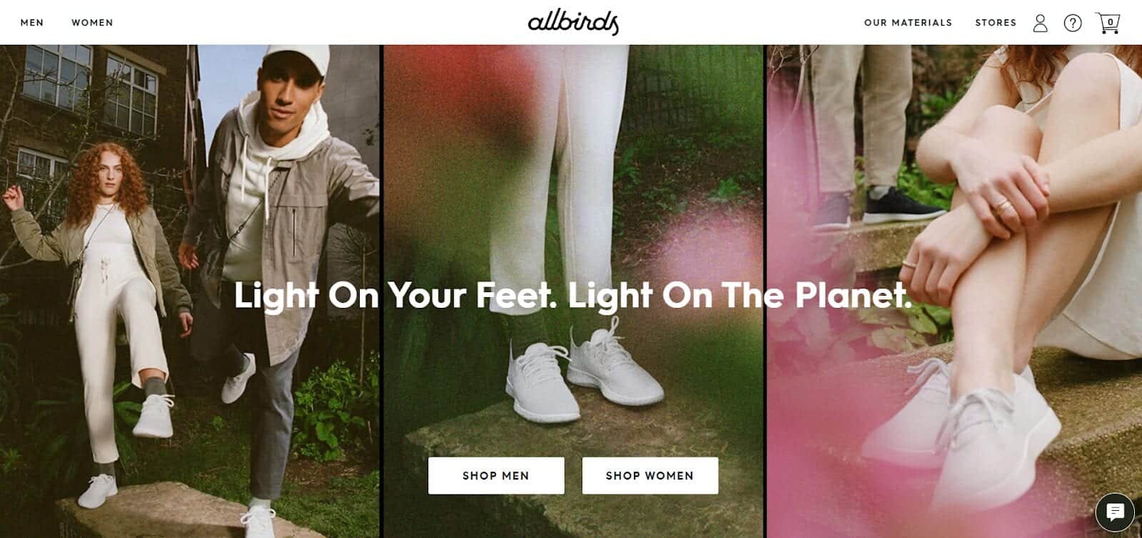
Allbirds is sustainable apparel that emphasises the vision using attractive copy and photos. A simple description below the homepage photos helps visitors know a suitable product even before clicking on it.
What you can learn:
- Powerful missions and brand stories. Can create an emotional connection with the audience. Allbirds also show sustainable corporation certificates and the brand’s complete sustainability approaches to gain trust.
Clear return policies. Give customers a feeling of security. The brand offers various size charts with a free 30-day return policy for getting a perfect pair.
9. Burrow
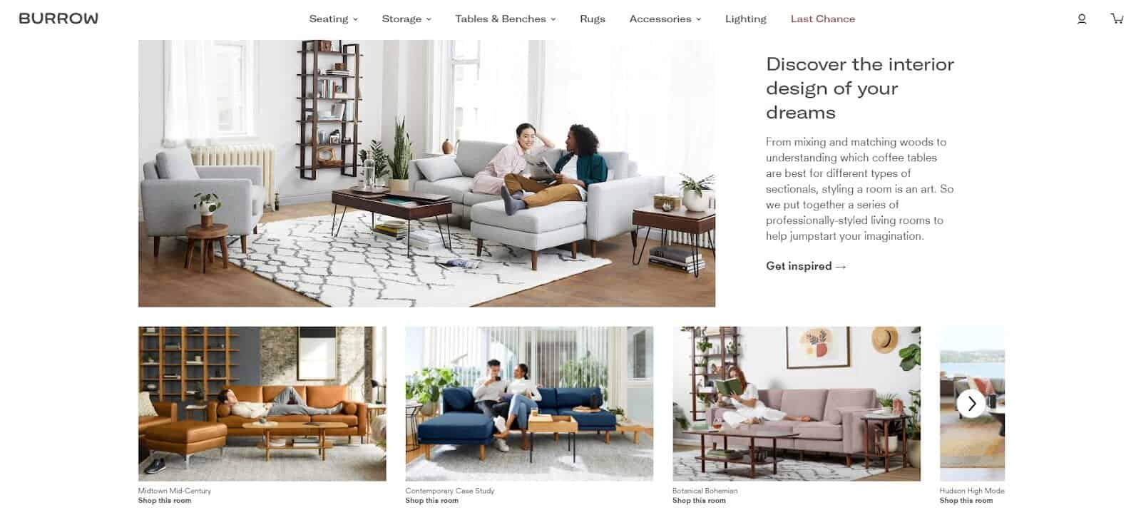
This furniture brand becomes one of Time’s 50 Best Inventions of 2018. Their website offers photos captured at different angles, and you can also shop by room styles to imagine how the furniture looks in your home.
What you can learn:
- Referral programmes. Provide exclusivity and rewards as customers become a part of the company.
- Free swatches and shipping offers. According to Statista, more than 50 per cent of online shoppers think free shipping deals are of functional importance when visiting e-commerce websites. Here, not only does Burrow offer free delivery, but they also provide free swatches to set the customer free from trouble choosing a colour.
Quick account registration. When signing up, users only input names and email addresses and additional shipping details when requesting swatches.
10. Everlane
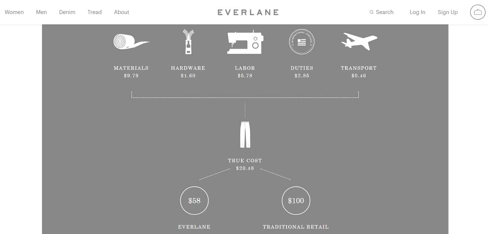
Fast Company has listed this fashion brand as one of the most innovative companies because of their brilliant campaigns; two are explained below.
What you can learn:
- Showing transparency. Radical transparency has been Everlane’s robust marketing strategy that aims to make people aware of the production processes. Based on Statista, being transparent is one of the vital features people love when visiting a brand’s website.
- User-generated content. The brand used selected summer holiday photos from their social media followers on their page. This type of content can generate customer engagement.
Conclusion
An astounding e-commerce website is more than an excellent design. Consider other essential elements, like powerful branding and return policies, from the ten inspiring e-commerce websites above.


