BK Vehicle Protection Systems
Blue Whale Media is excited to showcase the branding journey for BK, a UK-based company specialising in cutting-edge vehicle protection systems, extending its innovative solutions to markets across Africa. BK’s mission to provide top-tier, reliable vehicle security solutions in regions facing significant security challenges inspired a branding strategy that communicates strength, reliability, and innovation. Central to this strategy is the creation of a distinct and meaningful logo that resonates with BK’s core values and market goals.
Logo Design Philosophy
The logo design for BK was conceptualised to embody the company’s commitment to safety, innovation, and its unique positioning as a bridge between UK technology and African markets. Recognising the critical role of trust and professionalism in the security sector, our design team sought to create a logo that instills confidence in BK’s target customers while reflecting the company’s dynamic approach to vehicle protection.
The Logo Elements
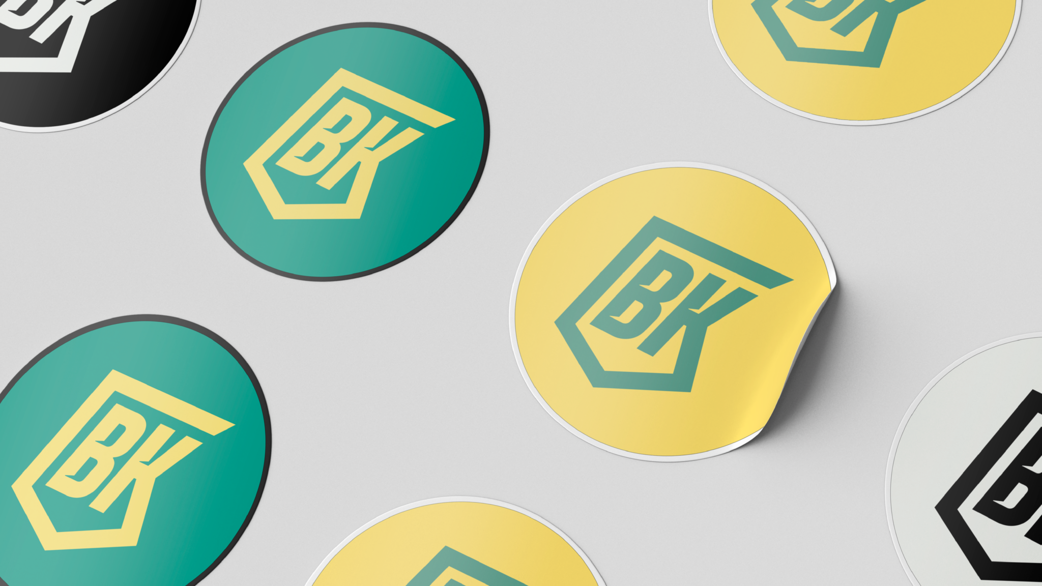
The BK logo is a harmonious blend of geometric precision, colour psychology, and symbolic representation, meticulously designed to convey the essence of BK’s brand identity:
Iconography: The logo is a stylised shield, representing protection and resilience, core attributes of BK’s vehicle protection systems. This icon is integrated with abstract elements that suggest movement and technology, illustrating BK’s forward-thinking and innovative solutions in vehicle security.
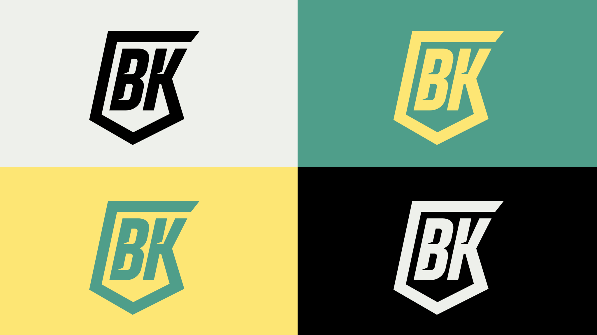
Colour Scheme: The selection of mint, yellow, black, and white was strategic, aiming to differentiate BK in the vehicle protection market while embedding deep symbolic meanings:
Mint: A refreshing and modern hue, mint represents innovation and growth, signalling BK’s commitment to developing new solutions in vehicle protection.
Yellow: This bright and energetic color stands for optimism and attention, highlighting the importance BK places on alertness and proactive protection measures.
Black: Conveying sophistication, power, and reliability, black underscores the professional and authoritative presence of BK in the security sector.
White: Symbolising purity and simplicity, white balances the logo’s composition, ensuring clarity and ease of recognition.
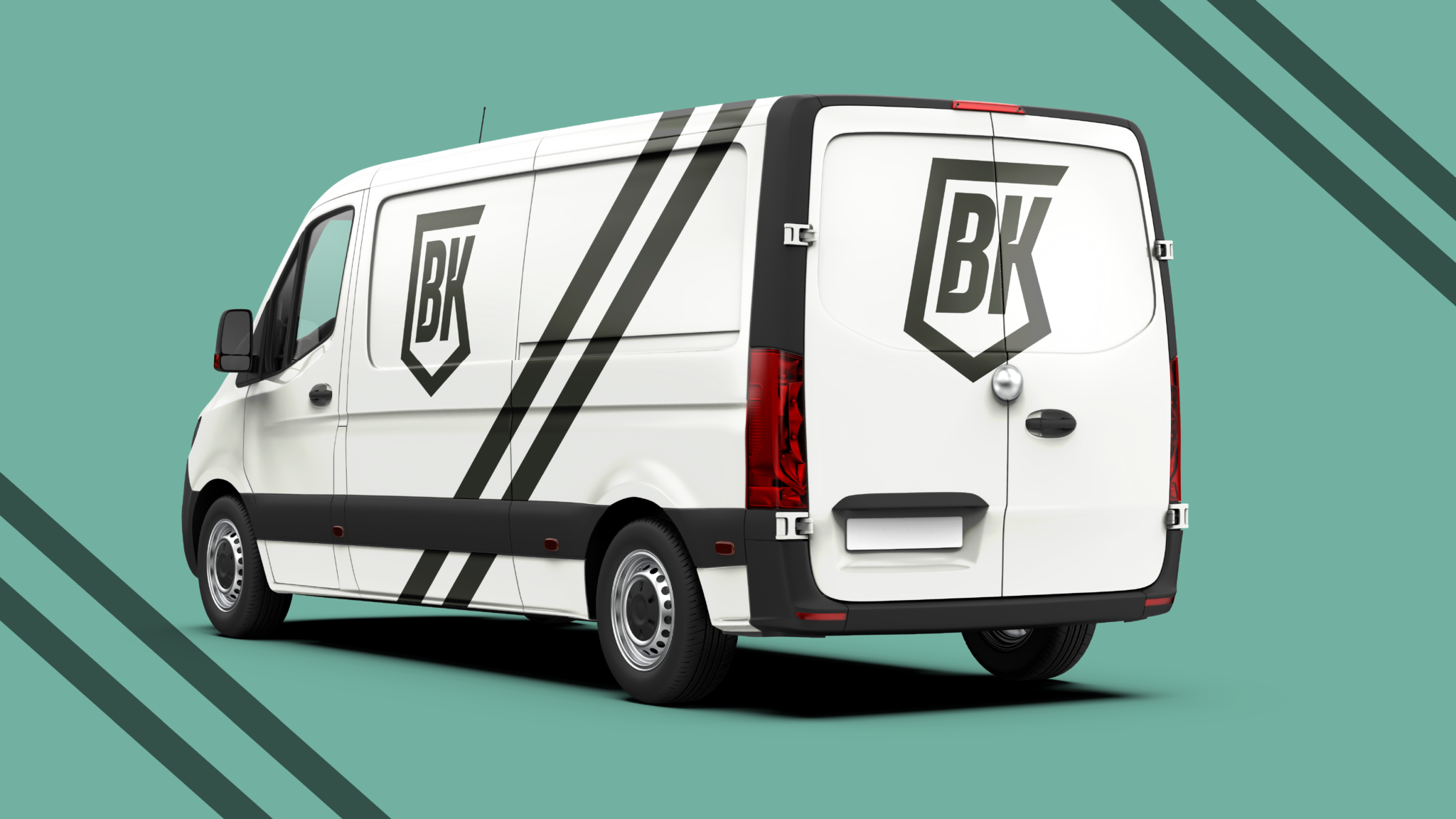
Typography: The logo features a bespoke typeface that is bold and modern, with clean lines that convey strength and stability. The simplicity of the font ensures legibility across various applications, from digital media to physical products, aligning with BK’s versatile and user-focused approach.
Client: BK Vehicle Protection Systems
Category: Logos
Date: 7th June 2023

Other Portfolios.
12
Years of success
It all began back in July 2011 as a tiny start-up company with just two employees. Blue Whale Media is now a successful digital marketing agency with multiple different sectors and a team of highly skilled employees. Here’s to many more years of Blue Whale Media!
802
Completed Projects
Our team works tirelessly to collaborate on many projects: from branding and website design to social media. We work together to ensure that our clients are satisfied with their projects.
230
Positive Reviews
Our number one priority here at Blue Whale Media is to ensure our clients love their websites as much as we love working on them! Our friendly and helpful staff are here to support you in every way we can to make sure our clients are more than happy.
519
Hours spent designing
We design a multitude of different elements from business cards to packaging however, website design is our passion! All our websites are bespoke builds, not templated, to ensure that they meet your business needs.
Let’s get creative.
Get started on your project with your design partners


