
Call-To-Action Examples: Designs to Earn Clicks and Generate Leads
People like to click buttons, over text, links, and images, which is exactly what you want. However, the trick is to get them to click the button you want.
Best Practices
Call-to-actions (CTA’s) can be used in lots of different ways and places, whether this is on your website, blog page, or email marketing. To make the most of your CTA’s there are some best practices to look out for are:
- Make them stand out
- Be brief
- Create urgency
- Personalise your CTA’s
- Easy to locate
Examples of CTA’s
Apple TV+

When you go to the Apple TV+ website you are brought to a page that has a video playing in the background with all the exclusive things you can watch only on Apple TV+ with a CTA saying “Watch now”. This draws viewers attention as the button is clear and easy to see. The only issue with this button is that it is a bit misleading as when you click the button it takes you to a landing page that you then have to click another button to sign up/sign in. This can frustrate customers, therefore cutting out this middle step would be more beneficial.
Netflix

Similarly to Apple TV+, Netflix shows what it offers in the background, except they use an image rather than a video. However, Netflix has a different approach to when it comes to CTA. For their CTA they get the customer to start filling out the sign-up form and use their button to take the customer to fill out the rest of the form. They also use an arrow after “Get Started” to show this will take you to the next step, whilst using their signature red to make the button stand out.
Spotify
Spotify has two parts to its CTA’s. One is for its premium account and the other is for its free accounts. For this, they use a slider to show the two offers.
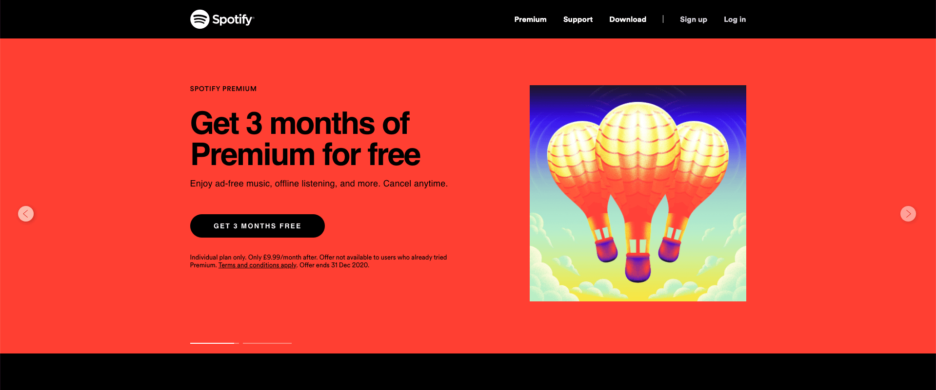
The first slide is their premium account, which is their priority as they are trying to get money from you. Their CTA is clear by telling you how long the free trial is for as well as making it stand out against the background. They are also brief but give you all the important information to reassure you before you sign up to their free trial, including that this is a special offer and shows when this ends.
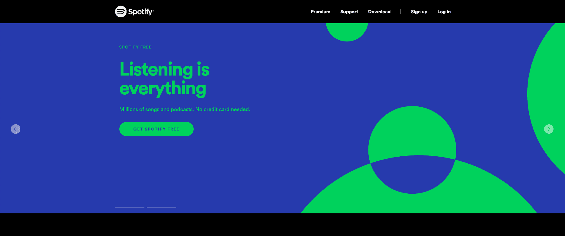
Their second slider is about their free account and gives you a CTA in their signature green that will take you straight to the signup page that doesn’t require a form of payment. To reassure customers they state this in a brief explanation before the button.
Spotify gives customers confidence about signing up to either type of account as it clearly states what is required by the customer. Therefore they know there will be no tricks as they were shown before choosing their account type.
Mailchimp

Mailchimp’s aim is to get you to sign up, preferable to one of their paid plans. This is why they have chosen their CTA to say “Pick a Plan”. To make this stand out they use a colour that will stand out against their brand colour of yellow. Their CTA directs their customers to make a decision on what type of plan they want and what they get access to on each plan before signing up. The reason they do this is that they have so many options, they want to make it clear to their customers what they will be paying for.
WooCommerce
WooCommerce uses two types of CTA’s.
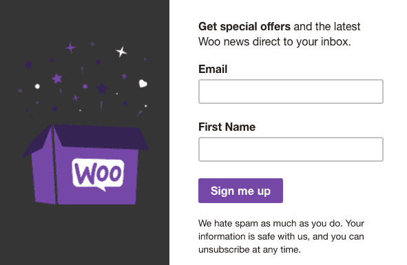
Their first one is a pop-up window that is for their newsletter. To make this pop-up more noticeable they made the image a GIF. Using this movement to catch the attention of the viewers. To make them more lenient to sign up, they also mention that you will be sent special offers.

For their second one, they use an image with what’s on offer. Then they proved some important information about the offer and when it’s due to end. This creates a sense of urgency making people more likely to buy something that they wouldn’t normally. After the information, they have two CTA’s but they have made one of them with a purple background, which makes it stand out. This is due to the fact that they want you to click the one they want you to click.
Conclusion
These are companies that all use CTA and get results. Finding a design that works well for you can take a few tries, so make sure you test different options. There are tools out there that can help you see how well your CTA is doing, like HubSpot and Optimizely, so don’t worry you’ll find the one that works best.

Call-To-Action Examples: Designs to Earn Clicks and Generate Leads
People like to click buttons, over text, links, and images, which is exactly what you want. However, the trick is to get them to click the button you want.
Best Practices
Call-to-actions (CTA’s) can be used in lots of different ways and places, whether this is on your website, blog page, or email marketing. To make the most of your CTA’s there are some best practices to look out for are:
- Make them stand out
- Be brief
- Create urgency
- Personalise your CTA’s
- Easy to locate
Examples of CTA’s
Apple TV+

When you go to the Apple TV+ website you are brought to a page that has a video playing in the background with all the exclusive things you can watch only on Apple TV+ with a CTA saying “Watch now”. This draws viewers attention as the button is clear and easy to see. The only issue with this button is that it is a bit misleading as when you click the button it takes you to a landing page that you then have to click another button to sign up/sign in. This can frustrate customers, therefore cutting out this middle step would be more beneficial.
Netflix

Similarly to Apple TV+, Netflix shows what it offers in the background, except they use an image rather than a video. However, Netflix has a different approach to when it comes to CTA. For their CTA they get the customer to start filling out the sign-up form and use their button to take the customer to fill out the rest of the form. They also use an arrow after “Get Started” to show this will take you to the next step, whilst using their signature red to make the button stand out.
Spotify
Spotify has two parts to its CTA’s. One is for its premium account and the other is for its free accounts. For this, they use a slider to show the two offers.

The first slide is their premium account, which is their priority as they are trying to get money from you. Their CTA is clear by telling you how long the free trial is for as well as making it stand out against the background. They are also brief but give you all the important information to reassure you before you sign up to their free trial, including that this is a special offer and shows when this ends.

Their second slider is about their free account and gives you a CTA in their signature green that will take you straight to the signup page that doesn’t require a form of payment. To reassure customers they state this in a brief explanation before the button.
Spotify gives customers confidence about signing up to either type of account as it clearly states what is required by the customer. Therefore they know there will be no tricks as they were shown before choosing their account type.
Mailchimp

Mailchimp’s aim is to get you to sign up, preferable to one of their paid plans. This is why they have chosen their CTA to say “Pick a Plan”. To make this stand out they use a colour that will stand out against their brand colour of yellow. Their CTA directs their customers to make a decision on what type of plan they want and what they get access to on each plan before signing up. The reason they do this is that they have so many options, they want to make it clear to their customers what they will be paying for.
WooCommerce
WooCommerce uses two types of CTA’s.

Their first one is a pop-up window that is for their newsletter. To make this pop-up more noticeable they made the image a GIF. Using this movement to catch the attention of the viewers. To make them more lenient to sign up, they also mention that you will be sent special offers.

For their second one, they use an image with what’s on offer. Then they proved some important information about the offer and when it’s due to end. This creates a sense of urgency making people more likely to buy something that they wouldn’t normally. After the information, they have two CTA’s but they have made one of them with a purple background, which makes it stand out. This is due to the fact that they want you to click the one they want you to click.
Conclusion
These are companies that all use CTA and get results. Finding a design that works well for you can take a few tries, so make sure you test different options. There are tools out there that can help you see how well your CTA is doing, like HubSpot and Optimizely, so don’t worry you’ll find the one that works best.
