How to make your email design stand out
Email marketing is a massive way of reaching your target audience can be a unbelievable way of driving new traffic. If this is something that is letting you down, then you need some quick tips that will help with creating more engagement to your business. 246 billion emails are sent and received worldwide in 2019. This just shows the mass of the market and how important it is to get it right. In this blog I will be talking about quick and easy ways to creating a more beneficial email.
Create a subject
If you fail to outline a clear subject then the likelihood of your email becoming effective will be low. The emails you send need to be clear in what they’re are saying or what you are trying to sell or promote. To approach this situation you need to make it clear what your email is regarding within the header so the reader knows immediately. Maybe hit them with a rhetorical question or address them more personally by sector for example. These simple tactics will you stand out. It is also important to title your email with something that sounds interesting rather than something dull like ‘read our newsletter’.
Make use of visuals
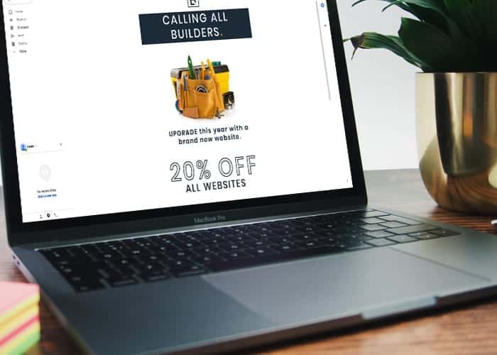
When creating an email it is important that you create as many visuals as possible. Humans tend to be drawn towards visuals which is why making use of images is crucial. This is not to say that text doesn’t have a place but big chunks of text will only bore the viewer. The text should be short and snappy and should only really accompany the images. Create something that really stands out and matches your branding.
Colours
Talking about visuals, colour is also a very important factor to consider. The colours you use should define your brand and build a mood. A confusing mix of colours will make your newsletter look unattractive and unprofessional making is more susceptible for the trash bin. Companies tend to stick with branded colours and use them only when necessary to make certain aspects of the email stand out and flow.
Breaking the email down
Similar to a flyer and email needs to be broken down into sections. This can be done through a series of techniques such as using headers, dividers and boxes to break up text and images. Its all getting you email into readable chunks so the viewer can digest it all. It needs to flow naturally so your brain isn’t confused and it understanding all the content they way its meant to do.
Legibility
Similar to the text, it is important that you don’t used too many fonts and especially those which a weird and quirky. This is because you want the viewer to have an easy time when reding it. Size of text will also play a factor as something that may look okay on a desktop might look completely different on mobile. A mobile responsive email reduces the risk of text not being legible which in turn can make your email look bad.


