
Fuel Hub – Art Direction
Fuel Hub is not just a meal service; it’s a lifestyle choice for those who seek both nourishment and flavour in their fast-paced lives. Blue Whale Media was tasked with encapsulating the vibrant and energetic essence of Fuel Hub in its logo design. The challenge was to create a visual identity that conveys the brand’s commitment to fuelling bodies with high-quality, nutritious foods.
Brand Vision
Fuel Hub aims to stand out in the meal service industry as a provider of not just food, but fuel for a life well-lived. They envision a world where fast food is synonymous with health food, and their branding needed to reflect this revolutionary approach.
Logo Design Philosophy
Our design philosophy was informed by the concepts of vitality, energy, and clarity. The logo had to resonate with health-conscious individuals looking for a quick and healthy eating option. We aimed to convey the message that Fuel Hub is the smart choice for anyone who values their health as much as their time.
Design Elements
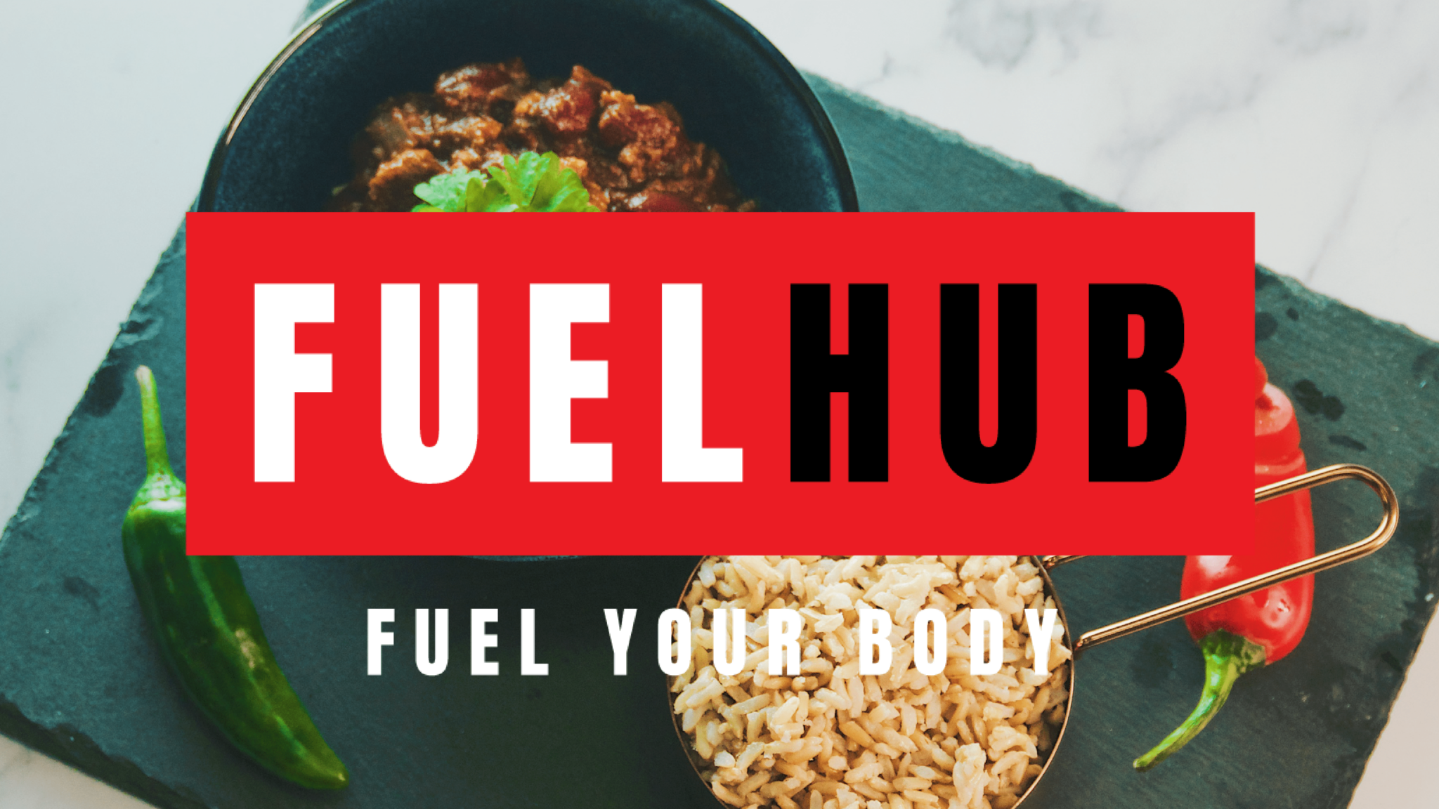
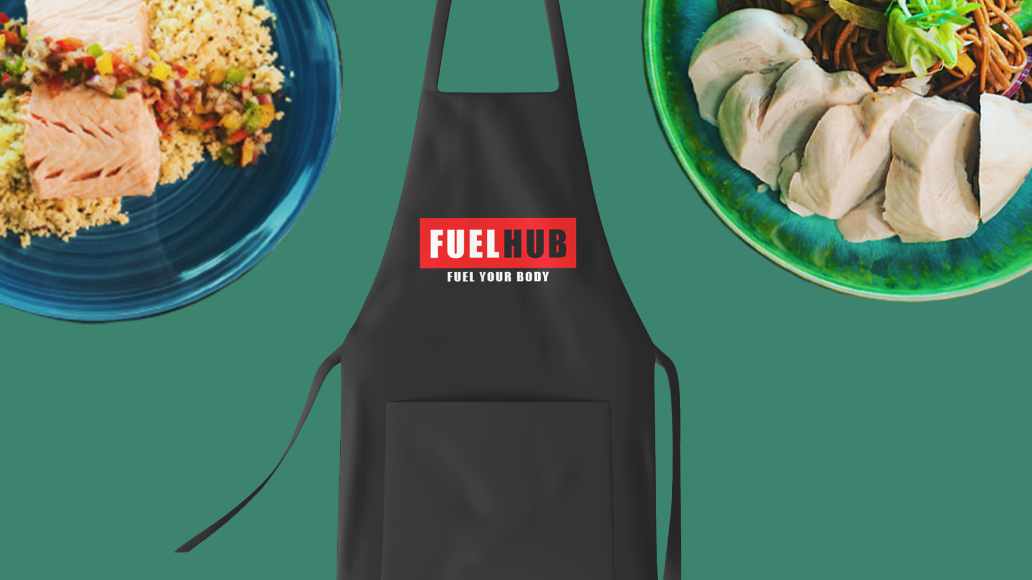
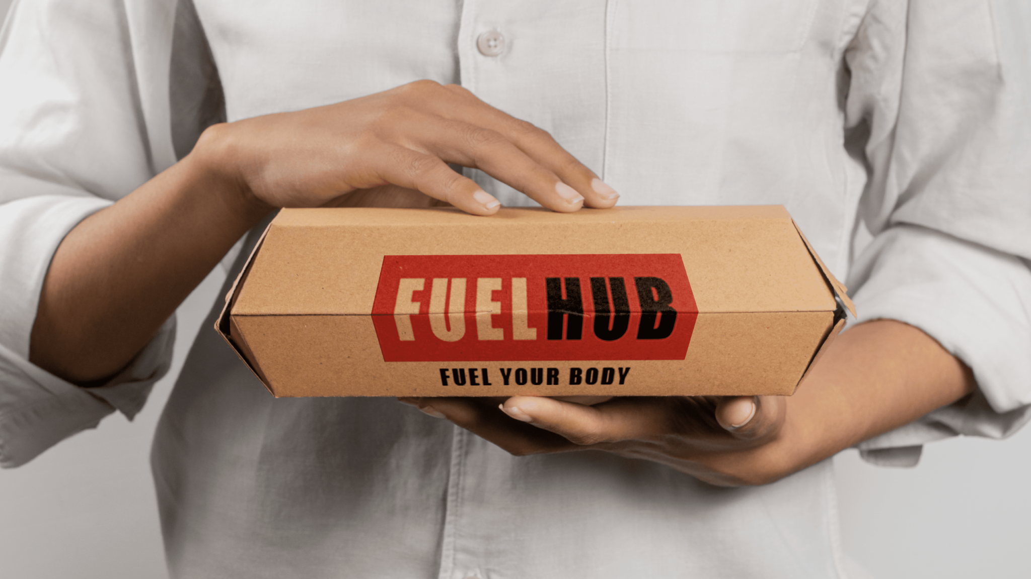
Colour Palette: The logo employs a bold red colour that captures attention and symbolises energy and passion. The red is complemented by the black text which adds a modern, powerful dynamic to the brand message. White is used to balance and bring clarity to the design, ensuring the message ‘FUEL YOUR BODY’ is easily legible and impactful.
Typography: The word ‘FUEL’ is featured in a large, bold font, dominating the visual space and emphasising the brand’s core value proposition. ‘HUB’ follows in a smaller but equally weighted font, maintaining the logo’s balance and focus. The tagline ‘FUEL YOUR BODY’ employs a simpler sans-serif typeface, delivering the brand’s message in a clear and straightforward manner.
Iconography: In this design, the art direction steered clear of traditional food imagery, opting instead for a striking colour block that captures the viewer’s attention. This bold visual approach reflects the brand’s emphasis on high-impact, high-energy lifestyle choices.
Brand Messaging Through Design
The Fuel Hub logo is designed to make a bold statement. It suggests that choosing Fuel Hub is not merely about eating but about choosing an energetic and vibrant lifestyle. The striking red backdrop commands attention, signifying a break from the mundane and a move towards an energized, health-focused way of life.
Client: Fuel Hub
Category: In Premises
Date: 19th May 2020
Other Portfolios.


12
Years of success
It all began back in July 2011 as a tiny start-up company with just two employees. Blue Whale Media is now a successful digital marketing agency with multiple different sectors and a team of highly skilled employees. Here’s to many more years of Blue Whale Media!
802
Completed Projects
Our team works tirelessly to collaborate on many projects: from branding and website design to social media. We work together to ensure that our clients are satisfied with their projects.
230
Positive Reviews
Our number one priority here at Blue Whale Media is to ensure our clients love their websites as much as we love working on them! Our friendly and helpful staff are here to support you in every way we can to make sure our clients are more than happy.
519
Hours spent designing
We design a multitude of different elements from business cards to packaging however, website design is our passion! All our websites are bespoke builds, not templated, to ensure that they meet your business needs.
Let’s get creative.
Get started on your project with your design partners


