How To Build An Engaging Contact Form
As a business owner, your website’s contact form is the bridge between you and potential customers. At Blue Whale Media, we understand that designing an engaging and conversion-optimised contact form can be tricky. In this blog post, we will share our expertise in bespoke website design to show you how to create a contact form that will convert visitors into loyal customers.
Why Contact Forms Are Important
At Blue Whale Media, we understand the importance of an engaging contact form on your website. Not only does it provide customers with an easy way to get in touch with you, but it also serves as a valuable tool for collecting additional information and building trust.
Best practices suggest incorporating conditional logic into your contact form design. This allows you to tailor the questions asked based on the user’s previous responses – resulting in a more personalised experience and increased conversion rates. Additionally, including clear CTAs and consistent branding throughout the form can further improve user experience and build credibility for your business.
Increase Conversion Rates
Our expert web design team in Wigan understand that an engaging contact form can make all the difference when it comes to converting visitors into customers. Simplifying your form fields and utilising conditional logic for additional information can improve user experience and increase conversion rates. Alongside this, a clear call-to-action button is essential in guiding users towards filling out your form. Incorporating social proof through customer reviews or testimonials on your page also increases brand trust and credibility, encouraging more submissions. By following these best practices in design, you can build an effective contact form that drives conversions for your business.
Improve User Experience
At Blue Whale Media, we understand that an engaging contact form is essential to improve user experience and increase conversion rates. Here are some best practices to consider when designing your contact form:
- Make sure the form is mobile-friendly: With more people accessing websites via their mobile devices, it’s crucial to ensure that your contact form is optimised for smaller screens.
- Provide helpful tips or explanations for each field: Adding additional information or tooltips can help users fill out forms quickly and accurately.
- Use conditional logic to show/hide fields based on user input: Conditional logic allows you to display only the fields that are relevant based on a user’s previous selections.
By implementing these design elements into your contact form, you can create a seamless experience for users while also strengthening your branding and credibility. Additionally, including clear CTAs (calls-to-action) throughout the process will encourage potential clients to reach out and engage with your business.
Build Trust and Credibility
Incorporating a privacy statement on your contact form is an effective way to show that you take user data seriously. Providing additional information about how you use their data can help soothe any concerns they may have had.
Another great way to build trust is by including clear and visible contact information such as a phone number, email address, or physical address for your business. This shows visitors that there are real people behind the website who they can reach out to if needed. Additionally, showcasing any awards or certifications earned helps establish credibility and reassures potential customers that you are a reputable brand.
Best Practices:
- Include a privacy statement on your contact form
- Clearly display contact information
- Showcase awards or certifications
- User experience tip: Use conditional logic in your CTAs so users only see options relevant to them.
Designing an Engaging Contact Form
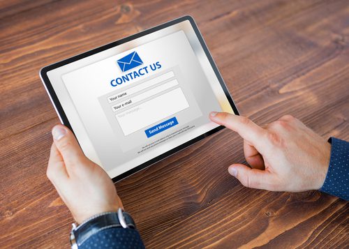
Designing an engaging contact form is crucial for your website’s success. To keep it simple and effective, consider including only necessary fields such as name, email address and message.
Use clear and concise language in your instructions to make the process easy for the user. Avoid technical jargon or vague terms that could confuse them. Additionally, adding a progress bar can help users feel more at ease with completing your contact form.
Making it visually appealing is also key to capturing user attention and increasing engagement on your website. Consider using contrasting colours or bold fonts to draw attention to important fields or buttons on the contact form. Ultimately, an engaging contact form will lead to higher conversion rates and better communication with potential customers on your website!
Keep It Simple
At Blue Whale Media, we believe that keeping your contact form simple is key to increasing engagement and conversions. Limiting the number of fields on the form is crucial, as it reduces friction and makes it easier for users to submit their information. Avoid complex wording and technical jargon as much as possible, opting instead for clear and concise language that everyone can understand.
Additionally, using a clean and minimalist design will make your contact form visually appealing while also improving its functionality. A cluttered or confusing layout may deter potential clients from filling out the form altogether. By following these tips, you can create an engaging contact form that stands out from the rest!
Use Clear and Concise Language
At Blue Whale Media, we understand that engaging contact forms are crucial for online business success. To create a user-friendly experience, use short and straightforward questions in each field. This makes it easier for your audience to fill out the form quickly and efficiently.
Providing clear instructions and feedback throughout the process is key. Your users should know what step they’re on at all times, as well as any conditions or restrictions that may apply. Customizing error messages to be informative and helpful will also reduce confusion while filling out the form, potentially increasing conversions. These simple language adjustments can make a big impact on user engagement with your platform.
Make It Visually Appealing
When it comes to designing an engaging contact form, visual appeal is key. A visually pleasing form can not only grab the user’s attention but also increase their interest in filling out the form. Here are some tips to make your contact form more visually appealing:
- Incorporate your brand colours into the form design
- Add images or icons to break up text and add interest
- Ensure that the font is easy to read on all devices
By following these tips, you can create a contact form that looks professional and grabs your visitor’s attention. Remember, first impressions matter!
Optimising Your Contact Form for Conversions
At Blue Whale Media, we believe an engaging contact form is the key to driving conversions. To optimize your contact form for conversions, make sure it includes relevant social proof such as testimonials and client logos. This helps build trust with potential customers and increases the likelihood they’ll reach out.
Additionally, including a strong call-to-action can push viewers to take action and fill out your contact form. Use clear language that encourages them to get in touch or schedule a consultation. By implementing these tactics and regularly performing A/B testing to improve conversion rates, you can create an effective contact form that drives business growth.
Add Social Proof
At Blue Whale Media, we understand the importance of building trust with potential clients. By including customer testimonials on your contact form, you can show visitors that others have had a positive experience with your business and are satisfied with the service they received. This social proof can help to increase conversions and build credibility for your brand.
Another way to add social proof is by showcasing awards or recognition received by your business. Including logos or badges from industry organisations on your contact form can demonstrate that you are an authority in your field and have been recognised for excellence. Additionally, highlighting the number of satisfied clients you’ve served can further reinforce this message and encourage visitors to reach out for more information about how you could help them too.
Include a Strong Call-to-Action
At Blue Whale Media, we believe that a strong Call-to-Action (CTA) is essential for an engaging contact form. Use action-oriented language like ‘Get in Touch’ or ‘Start Today’ to prompt the visitor to take action. Additionally, place the CTA button prominently on the page where visitors can easily find it and make sure it’s relevant to what they’re looking for. A clear CTA helps guide potential customers towards conversion and increases your chances of generating valuable leads.
Use A/B Testing to Improve Conversion Rates
At Blue Whale Media, we believe that A/B testing is an essential tool for improving your contact form’s conversion rates. Testing different form layouts and designs can have a significant impact on user engagement, helping you determine which design resonates best with your target audience. Experimenting with different form lengths and fields can also help to streamline the process, making it easier for users to fill out the information necessary to convert. Additionally, trying out various CTA text and placement options can help guide users towards completing each step of the form submission process smoothly. By using A/B testing in this way you’ll be able to identify improvements quickly and efficiently while creating a more engaging experience for your website visitors.


