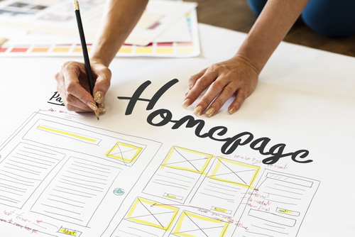
Homepage Web Design: Why It’s Important, Features, and Examples of Companies That Nailed It
When you’re selling a house, it doesn’t matter how amazing the layout, how impeccable the craftsmanship, and how immaculate the interior design may be, if the landscaping is overgrown, the driveway and walkway are crumbling, and the facade is uninspiring, it’s pretty much guaranteed that your selling power is going to decrease. Now, if you have a website, apply the same idea to your homepage.
A homepage to a website is what curb appeal is to a house. Just like a home’s exterior, a homepage is the first thing that visitors see when they click on a website; their first experience with a site. Like the condition of a home’s exterior will have a direct impact on how prospective homebuyer’s view the property, the appearance and layout of a homepage has a direct impact on the way visitors – and prospective customers – view your website. If you want to pique the interests of site visitors, encourage them to look around and explore, and eventually complete an intended action (whether that is completing purchase, signing up for a newsletter, booking an appointment, or whatever the case may be.), a well-designed, easy to use, and informative homepage is an absolute must.
The Features of a Well-Designed Homepage
A homepage should be thoughtful and well-designed, and should include the following website features:
- A simplistic, yet aesthetically pleasing design
- An attention-grabbing, easy-to-read, and relatable headline and sub-headline
- An enticing calls-to-action (CTA)
- A visually pleasing colour scheme
- On-brand imagery
- Easy to read, engaging, and relatable typography
- Simple navigation
- Logo and branding elements
- Clear and concise mission statement and tagline
- Proof of credibility
- Contact information
These are just some examples of the elements that a well-designed homepage should contain. With these features in mind, let’s explore some examples of companies that have nailed their homepage design.
Our team of web developers in Liverpool have rounded up the following examples of some of the best business website homepages in 2022:
Airbnb
Airbnb’s homepage is the perfect example of what a thoughtfully designed and super-effective homepage should be. Upon visiting the site, you’re greeted with a visually pleasing imagery that makes you feel welcomed and makes you want to explore more, while the minimalist design clearly conveys what the company is about. The navigation menu is easy to find and easy to use, and with just a single sentence, Airbnb catches your attention. The destination and date search form, which the majority of site visitors are seeking, is right up front, and directs you to the next logical step. In addition to lodgings, a collection of both popular and unique getaways and adventures are suggested right on the homepage, too.
FreshBooks
As soon as you land on the FreshBooks website, you automatically know what the company is about, thanks to a clear, concise, and easy to digest headline. The design of the page is very easy to digest. There’s a lot of debate about the length of a homepage; specifically, whether a longer or shorter homepage is best. For those who decide to go the latter route, scrolling and reading the page has to be easy, and that is precisely what FreshBooks has done; in fact, the homepage functions kind of like a story, so-to-speak. The use of contrasting, yet visually pleasing colour scheme with the company’s main calls-to-action is brilliant, and the positioning of the text is well-done, too. The calls-to-action copy, such as “Now 60% Off for 6 Month”, and “Get Started for Free Today”, are undeniably compelling.
REI
The homepage design of one of the world’s leading distributors of outdoor recreational equipment and gear, Recreational Equipment, Inc. – better known to consumers as “REI” – is another excellent example of a thoughtfully designed homepage. As soon as you land on the homepage, it’s clear what REI is all about, as the navigation tabs, such as “Camp and Hike”, “Climb”, “Cycle” and “Water”, are direct, to the point, and are undeniably related to outdoor recreation. The colour scheme is attention-grabbing and exciting, yet soothing, and the imagery is captivating and easy to relate to. The typography is simple and easy to read, and the calls-to-action are clear. It’s just exactly what the design of a website’s homepage should look like.
Etsy
The world’s largest platform of independent merchants, as soon as you soon as you land on Etsy’s homepage, there’s no confusing what the site is about. The header image keeps you abreast of the latest web design trends, and directly under the header, you can learn about the basics of the easy to use online marketplace. Like every other site listed here, the navigation used on Etsy is fantastic, as it’s really easy to use. The imagery and working on the homepage just makes you want to start shopping!
Netflix
Netflix is one the most widely used streaming platforms on the planet, and if you didn’t know that before you visited the site, you will as soon as you see the homepage. The visuals, including the imagery and typography, are attractive, the call-to-action is clear, and visitors instantly understand what the streaming service is all about. Of all the homepages featured on this list, Netflix is perhaps one of the easiest, yet most effective examples – if not on the internet.
Chipotle
The layout and design of Chipotle’s homepage clearly displays what that the company’s mission is all about: serving the public food with integrity. The imagery, which includes a live-action reel, shows that the food is the company’s main attraction. Well-placed titles make it easy to learn more about the company and the menu, and the simple navigation makes placing individual, catering, and group orders a breeze.
Dropbox
Dropbox, a file hosting service that offers a variety of options, including cloud storage, personal cloud, file synchronisation, and client software, has two different pages: one for individual users and one for the business sector. Whichever one you visit, both are excellent examples of how to do simple homepage design well. While it’s true that there aren’t any remarkable images or video reels, that doesn’t make the homepage any less visually pleasing and effective. An overview of the basic functionality, a few CTA tabs, and a soothing and aesthetically pleasing colour scheme, and clear typography, as well as some simplistic images, are all that’s needed to create an effective homepage design.
Mint
When it comes to managing your personal finances, you want to be 100 percent sure that you’re working with reputable, experienced, and knowledgeable experts that have a proven track record of success, and that you know that you can trust. When you visit Mint’s homepage, a free app that simplifies the process of budgeting and tracking expenses, you’ll instantly feel at ease. That’s because the design of the homepage – everything from the imagery, the colour scheme, the typography, the CTAs, the navigation, etc. – just makes you feel like you can trust the financial experts to assist you with managing your finances and planning your budget. The block structure of the design and the soothing hues are simplistic and laconic. The copy is brilliantly done, as it’s easy to read and clearly explains the features in a question-answer format. They even took a creative approach to the site’s “Log In” tab, as the incorporated lock imagery lets you know that security is their top priority, and makes you feel further at ease.
Ted Todd Insurance
While insurance can be daunting, overwhelming, and even downright frustrating for many, Ted Todd has done an excellent job of making it a lot less threatening with the brilliant homepage design. They use imagery that’s familiar, friendly, and welcoming – a family going about their daily routine – which instantly makes you feel at ease, as it appeals to family values and responsibility. The light tones the minimalist colour palette are visually pleasant, and makes you reconsider whatever preconceived notions and attitudes that you may have about insurance companies. The insurance products the company offers are neatly organised underneath a central block, so you can easily find exactly what you’re looking for. There’s a handy carousel of blocks, too, that highlights the key details about each coverage option, which is handy. The text “Change the way you feel about insurance” may be the secondary CTA, but it’s most certainly the key message, and that’s exactly how you’ll feel upon viewing and interacting with the site’s homepage.
Ryan Edy
The primary objective of a website’s homepage is to provide visitors with information about the company and the products and services that they offered. Well, Ryan Edy’s homepage not only completed this mission, but excelled at it. A photographer, Ryan Edy showcases a collection of his projects and works, and nothing more, clearly fulfilling the goal of a homepage. The images are displayed in plates of varying sized, and scrolling through, you’ll instantly gain an understanding of his style and what he is capable of doing. The images appear static, but when you hover over each one, they come to life, revealing more about each photo. Navigation along the top of the page is simple and clear. The homepage design of the Ryan Edy website really is a job well done.


