

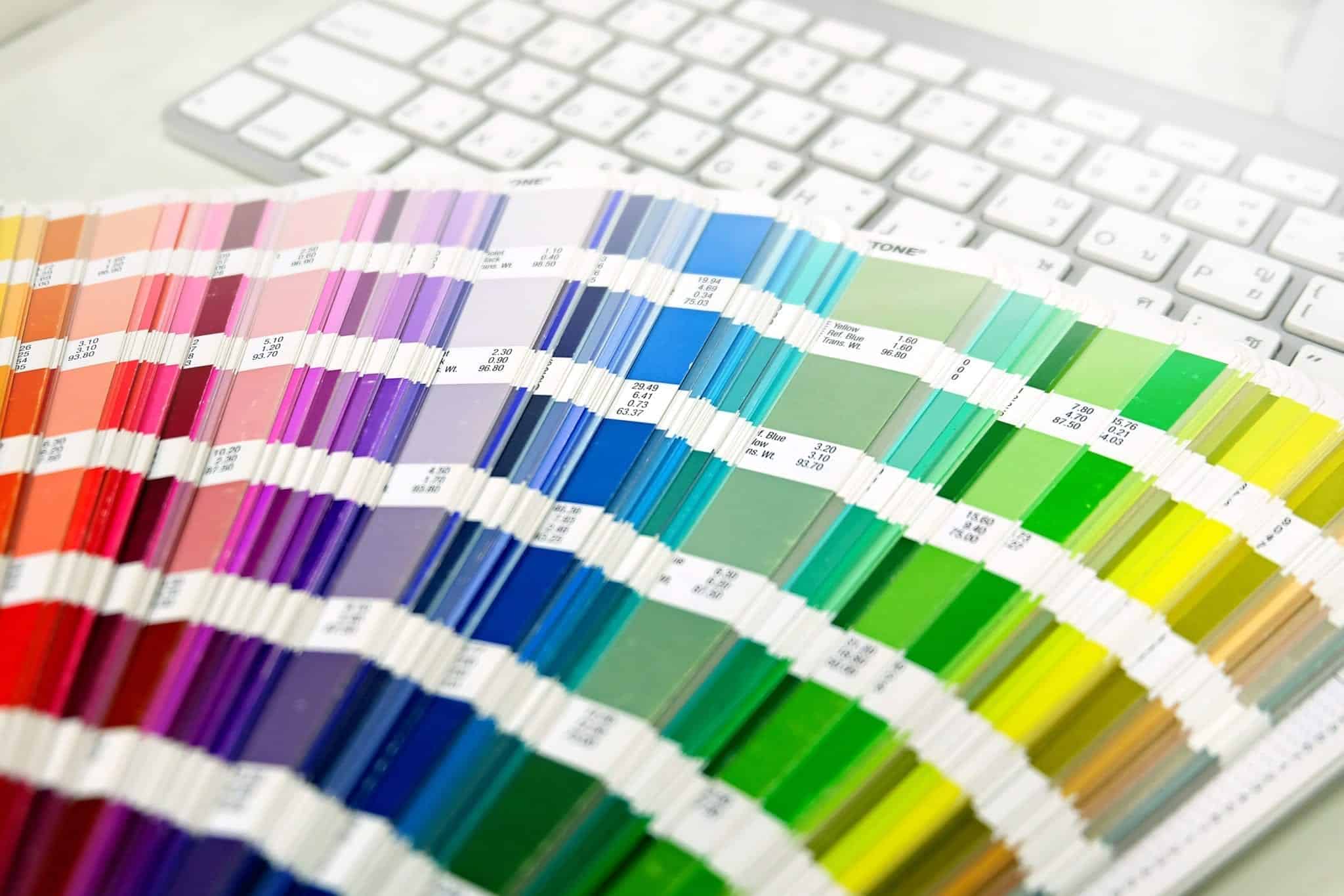
Organic Food Colour Palette
A colour palette is essential for any branding or marketing campaign. By having a set of colours that represent your brand, you can use them across multiple platforms consistently. It might be easy to pick colours that you like but picking colours that truly showcase the services you offer can be a difficult task. There’s so much more to colours than you think, trust us!
Colour Emotions
You might not have noticed but colours can affect the emotions of each person. They have specific connotations attached to them that can bring forward emotions. For example, the colour blue can relate to a sad feeling, the colour red can represent anger and the colour pink is usually seen as a calm and feminine. Just by using a certain colour, you can impact the feeling a customer has. As a web design company in Manchester, we have to ensure we choose the best colours – not only for the aesthetics, but also to create the correct sense of emotion.
Industry Colours
As previously mentioned, colours can bring on certain emotions however certain colours can have multiple effects on a person and can be represented differently depending on how they are used. For example, a lot of solicitors use the colour blue as it can also be portrayed in a professional manner too. In addition to this, the colour red has multiple connotations attached to it. In some ways, it can represent anger and aggression but on the other side, it also represents love like on valentines day. If you use them correctly, you can adjust the emotions that are portrayed to the customer.
Branded Colours
When you have your colour palette, it’s time to start using it within your branding. As you probably already know, branding is key to any business and affect your online identity. The main place to use your colour palette is on your website. The colours will give you a starting point for the design element and will allow you to keep consistency throughout the pages. In addition to this, a colour scheme can be used in your branding on social media. Whether this is for your logo, social banners, individual posts or videos, the colour palette will be the first thing you think about. Obviously, there are more areas that your colour palette can be used like your office stationery, roller banners, business cards, leaflets, branded clothing and much more.
Chosen Colour Representation
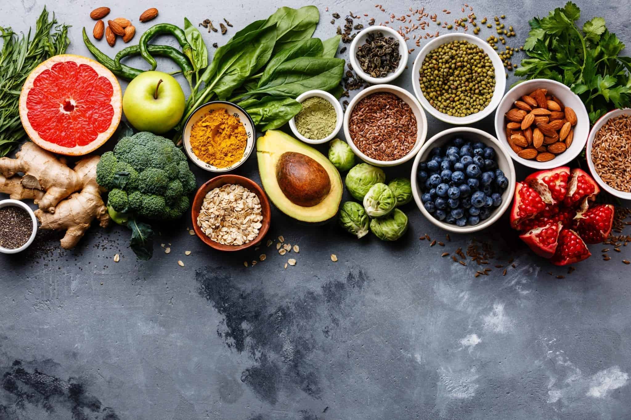
The chosen colours for this blog are quite bright and vibrant. They have been chosen to represent the organic food industry. This is due to the palette actually drawing in colours from the foods that are used in organic foods. The greens represent foods such as broccoli, peas, peppers, kiwis, lettuce, the red represents foods like peppers, apples, berries and tomatoes. By using these colours within the palette, the customer can already see the connection to the industry. The brightness of the colours also portrays a happy feeling which is what the company will want people to feel when eating their food. This is why the colours chosen are the perfect choice for the organic food industry.
Picking The Right One
When it’s time to pick your colour palette, you need to think about all the different factors with regards to emotions, industries and branding. Once you have the right colours for your business, it’s time to start using them effectively. If you need help creating the right graphics for your social media or website, get in touch with our team by visiting our website at https://www.bluewhalemedia.co.uk/


