
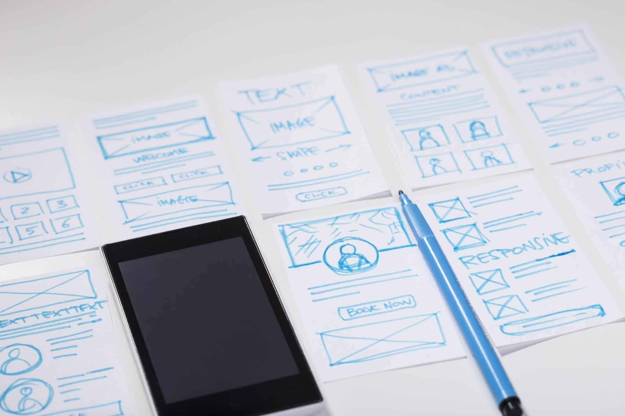
Responsive Web Design VS Adaptive Web Design
Crafting your own website is the best way to kick-start your online business venture. However, things aren’t always simple. When you proceed to undertake the technical aspects of creating a website, you will have the option to either go for a responsive design or an adaptive design, depending on factors such as whether you are building your own website or if you are hiring a website design company in Liverpool such as Blue Whale Media.
Technically, web design plays a massive role in shaping the overall performance of your website. Over the course of time, the amount of
online content consumption has undergone a mammoth transformation. The number has certainly increased, but the mode of accessing content has also diversified.
Modern-day websites need to be optimized and designed intricately well to ensure they run consistently smoothly across different platforms.
Both responsive web design and adaptive web design can help you achieve a specific set of ideal objectives. They (obviously) come with their own cluster of pros and cons.
So, which design is ideal for your website? And why is responsive web design so important?
We will look at all the different aspects of both the web design components so you can decide which one suits your website best.
What Is Responsive Web Design?
In its most simplistic nature, responsive web design refers to that specific design approach that allows your webpage to respond consistently across different platforms. This is especially applicable to devices with different screen sizes. It uses CSS media queries to respond ideally to different devices.
In brief, responsive web design will enable your website to respond to change in the browser’s width and adjust its placement to enable smooth functioning.
Pros of Responsive Web Design
Simple and easy to implement
Possibly the most appealing benefit of responsive web design is that it is extremely simple and easy to implement. So, if you’re particularly someone who is new to web design, a responsive approach is the ideal choice.
In the case of responsive web design, you only have to create a single design that can respond and adjust itself according to different device sizes. Hence, you do not need to invest much time nor resources to implement such a system.
Fluidity
While both responsive and adaptive web design offers some degree of fluidity, the former usually offers a more convincing fluid performance. Responsive web design enables your website to scale according to the user’s screen space. And, that, in turn, ensures exceptional smooth performance on both the large and small screen, as opposed to fixed-width layout design.
In addition, responsive design will also ensure that your users do not miss out on any content irrespective of their screen size. The conventional practice of designing a website to suit different platforms usually means reducing content for smaller screen devices. That is not the case for responsive web design.
SEO-friendly
Responsive web design comes with one crucial beneficial aspect, and that comes in the form of Search Engine Optimisation. Recent trends have shown that websites that use a single URL for different device platforms perform better on search engine result ranking.
This is primarily due to the fact that multiple URLs make it difficult for search engine algorithms to identify the original source. In contrast, using only one URL across different platforms creates consistency. Thus, making it easier for search engine algorithms to rank your website.
Cons of Responsive Web Design
Poor site speed
The most underwhelming aspect of responsive web design is its poor speed. Conventionally websites are designed differently for varying device platforms. They are optimized in order to ensure smooth and consistent performance on mobile devices.
However, in the case of responsive design, website optimization is minimal. You’re basically running the same website on different devices. Thus, the loading speed can be a major issue.
Poor user experience
While some users may prefer familiar website design across different platforms, a generous group of users beg to differ. A website designed for a computer screen may not necessarily be ideal for mobile devices.
The layout that seems intuitive on the big screen can quickly feel cluttered and confusing on a smaller screen. This, in turn, can promote a very poor user experience for people using smaller screens to access your website.
What is Adaptive Web Design?
In contrast to responsive web design, wherein users create a single website and adjust its design pattern according to varying screen sizes, adaptive design works quite oppositely. In an adaptive web design approach, users create multiple website layouts according to different screen sizes.
Simply put – users create a separate website for individual screen sizes. Usually, designers create an adaptive website for six common screen sizes – 320, 480, 760, 960, 1200, and 1600. An adaptive web design approach is also usually the more standard practice amongst the existing websites as well.
Pros of Adaptive Web Design
Good user experience
Rich user experience is unquestionably the biggest advantage of preferring adaptive web design. Unlike the responsive design approach, the adaptive design enables you to tailor multiple sites to ensure a smooth and uninterrupted performance.
Sure, the work involved may be a tad bit harder, but ultimately a good user experience is what matters most. After all, user experience is one of the most crucial driving forces to boost your website traffic and generate more sales.
Quick loading time
Another advantage of adaptive web design is that it ensures quick webpage loading irrespective of what device your users may be using. Adaptive design helps you optimize your website for different screen sizes individually. This inevitably enables your website to load up quickly as opposed to trying to fit a large number of content into a smaller screen.
Superior content control
Optimal content control is another aspect of adaptive web design that makes it a tempting choice. With adaptive web design, you can tailor your websites according to the individual screen dimension. This, in turn, allows you to control which content you want to optimize and prioritize as opposed to trying to squeeze in all the content together.
You can manage which information you want to prioritize so your customers don’t miss out on them and ultimately take the right action.
Cons of Adaptive Web Design
Not ideal for SEO
Duplicate URLs are the main obstacle for search engine algorithms. Multiple URLs often confuses the search engine algorithm and prevents them from identifying the main source. Under such cases, the time involved in inspecting every individual URL can severely diminish your website ranking. In addition, duplicate URLs can make your website vulnerable to third-party interference as well.
More work involved
As obvious as it may seem, creating individual sites for different device sizes requires a substantial amount of resources, time, and money. Of course, the extra work involved ultimately reaps good benefits.
But, it is certainly not an ideal venture for start-ups or businesses with a limited workforce and budget as well.
Conclusion
The choice between responsive and adaptive web design is an entirely subjective affair. Ultimately it comes down to what you want to achieve with your website. As mentioned above, both the web design methods come with their set of pros and cons.
You have to weigh their respective attributes and choose the one that is both convenient and optimally beneficial for your website. If you need help or have questions about whether our business website should be a responsive design or an adaptive design, you can speak to our team of local web designers. Blue Whale Media are here to help your business grow online – contact us today to find out more.


