
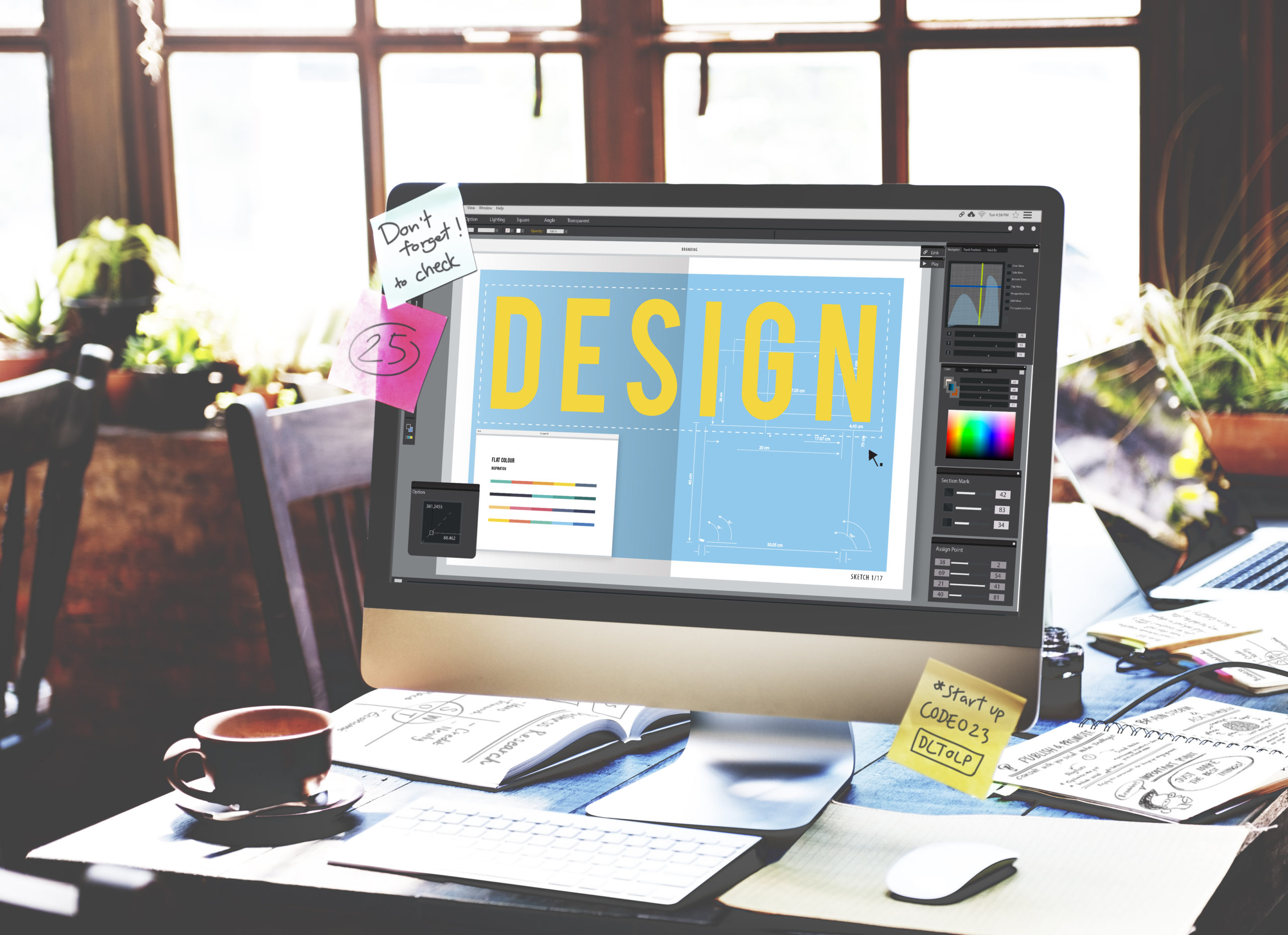
Understanding Basic Design Principles
When creating effective graphics, it is important to consider these principles. Understanding and successfully applying these concepts are essential for your design’s clear communication, aesthetical proficiency and professionalism. It is extremely important to learn these concepts, know when you are using them and apply them consistently. It may help to devise your own mnemonic or acronym to recall this information all throughout your design projects.
Contrast
This is a highly important concept used to differentiate between various elements. The concept helps assign individual characteristics to aspects to set them apart from the others. This can be achieved using altered type, colour, size, line, shape, and thickness. Contrast is a vital force in the strive for audience engagement. The device aims to capture users’ attention as well as offer the ability to draw focus to certain items, highlighting key parts or information within the design.
Repetition
Using this method helps to strengthen and unite aspects of the design. It establishes a relationship between various components, creating the notion that it was a deliberate design decision. It helps to organise segments and reinforce the consistent motivation of the piece to the audience. A method of using this concept is using a small range of typefaces, integrated patterns or image styles consistently. Additionally, when designing for a client it can help promote a unified connection between the graphic and branding of the company.
Alignment
This principle determines whether the placement of graphical content and/or information is consistently positioned throughout the project. Delivering this principle will result in a neat and sleek aesthetical outcome. Properly aligned graphics display a high quality of professionalism and a confident composition. Alignment is rarely broken; however, it may be altered usually only to achieve an intended design effect. Designers can achieve successful alignment using pre-set or custom guides to assist in the accurate positioning of assets. Additionally, having templates for projects that may need to be similarly reproduced.
Proximity
Defines the relationships between elements, by grouping them together, separate from other unrelated items. This can be achieved through the specific placement of aspects and integrating surrounding whitespace to divide up the contents. Some content may require the use of barriers to indicate groups, as spacing may be limited. This is effective as it balances the content and can minimalize excessive whitespace. It can also reduce the amount of clutter and create a sense of hierarchy within the content.
Mastering the Principles
If you continue to use these devices throughout your work, it will give you the basic foundations of ‘good’ graphic design. However, these are a mere few of the principles used today and you will discover more, as your abilities and knowledge of design develops. After practising and mastering these skills, consider developing rhythm, hierarchy, balance, and emphasis, to elevate the quality of your projects and advance your graphic design skills even further.


