Website colour schemes: Vivid and Sharp
Colour has been used as a powerful form of communication throughout our history. Over the years, scientists have continued to study the psychology of colour and its impact.
From the clothes we wear to the trinkets we buy, colours evoke different feelings and emotions that influence our everyday decisions.
Memory retention and recall are also enhanced through colour, which is pretty essential when it comes to remembering a specific product or brand. It is why businesses and organisations tend to place so much importance on getting their branding right.
Colour also helps towards building a content hierarchy, focusing attention on vital information and calls to action.
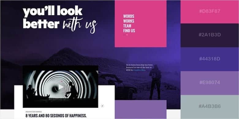
Vivid and Sharp Colour scheme: Pink, Purple and Black
Within this particular colour scheme, the vivid but sharp colours or pink, purple and black are mainly used. The colour pink is a non-threatening color that calms and reassures the viewer; it is associated with love and romance. The colour purple is associated with wealth and royalty; it stimulates our minds and encourages intense contemplation. The colour black is associated with authority and power, but it can also seem sophisticated and sleek to its viewers. The vibrancy within these colours can influence visitors’ emotional responses. Brighter colours can make you feel more energetic and darker shades can relax you and help you focus more on content.
Palettes and patterns inspired by the 80s and 90s
Everything old is new again — 2019 web design colour trends are no exception. The vibrant colour schemes and electric hues that defined the 80s and 90s are making a bold comeback in web design. Some designers are abandoning the colour safety nets of the past and are now taking risks with vibrant colours to create memorable visual experiences.
Keep it simple
A complicated and busy colour scheme often confuses the eye, whereas keeping things simple has two significant benefits. The biggest benefit is that simplicity can effortlessly tie together a colour scheme. Another benefit is that viewers don’t have to work hard to process what’s going on. That’s one of the hallmarks of a great website. If you go overboard on the color, your users will be more confused.
Create Bursts of Interest
Sometimes colour is explicitly used to add interest to a design. Large and bold colors don’t always have to be front and center in design for colour to be used effectively. As long as it’s strategic, using bursts of colour can be a good tool.
The Importance of Colour in Web Design
Working with colour can be very complicated as there are many variables to take into account when designing websites. The use of colour in web design can make a difference to the user experience and, ultimately, the conversion rate. Not only can colour help make a website more memorable and provoke emotional stimulation, but it can also make the user experience more enjoyable, resulting in higher conversion rates.
Colours bring web design to life.
Colours are everywhere and when used correctly, they can promote any emotion or action you’d like from web visitors. Colour theory is just a tool in the gamut of countless tools that you can use to create an outstanding web design. You want your site and brand, to be remembered by visitors.
We see more strategic use of colour on websites, whether it is to create better branding or make a bold statement. Above all, colour helps bring about personality and, most notably, brand identity.


