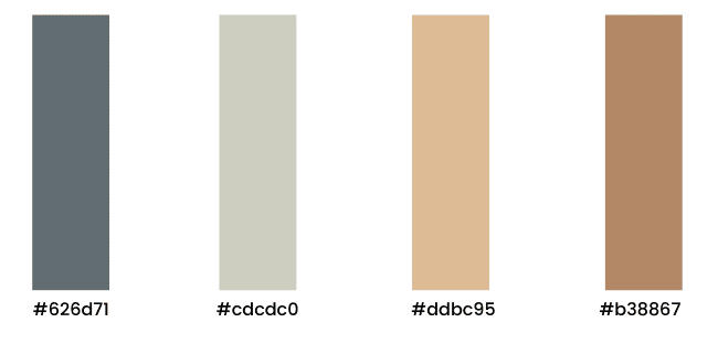
Coffee Shop Colour Palette
A colour palette is a staple in any branding. They can be used in different aspects of work but it is predominantly used in the design. Colour palettes can help you style any designs you create to ensure your branding is consistent throughout. In this blog, you’ll find out why colour palettes are needed for every business website design and see an example of the perfect colour palette.

The Importance of a Colour Palette
As previously stated, a colour palette is needed for every company. Not only does it help establish your brand but it also allows people to recognise what sector you work in. Colour is also a great communication tool as colours can affect how people feel and what they do. This might sound a little crazy but stay with me. It has been confirmed that people will decide if they’re attracted to marketing message based on the colours they use. Think about the connotations that already come with specific colours. Yellow usually
portrays signs of happiness and sunshine whereas green signifies nature and freshness. When you see red you think of danger and power and when you think of black you relate it elegance and authority. Now you know the importance of a colour palette, it’s time to start thinking about what colour palette will work for your business.
Picking a Colour Palette
Picking a suitable colour palette for your business can be a time-worthy task. It’s important to get it right so you’re branding is always on point. Firstly, you want to do some research on similar businesses within your industry and see what colours they are using to portray their message. See what colours are used to represent the industry you work in and go from there. It’s important not to copy someone else’s colour palette as this can get confusing when trying to establish your unique brand. You need to have a good idea of the colours you want and then play around with different shades and tones. This way you can see what looks best for your business. There are many tools online to allow you to do this but it’s important to remember the hex code for each colour within the palette.

Colour Palette Representation
The colour palette I have chosen is the perfect example of a neutral scheme. These specific colours are very calming as there is no vibrancy in any of the chosen hexes. The theme of this colour palette is a very mature and modern feel. This is portrayed by the mixture of brown and grey. The colour palette itself represents a very peaceful mood as the colours do not portray any negative connotations.
Industry Colours
As mentioned before, every colour palette has some relation to a specific business industry. For this colour palette, I would say it would be best suited to a coffee shop. The reasoning behind this is the fact that the colours used are similar to coffee colours which shows the connection with the business and the colours. The colour palette is also very calm and neutral which links to how you would want to feel when sitting in a coffee shop. As people go there to usually relax and take a minute to enjoy their drink, you would want to try and represent that feeling within your colour palette. I would say that this colour palette is the perfect choice for a coffee shop business and has probably already been used by cafes already.
Where to Use
Now you know why a colour palette is important, how to choose your own and seen an example, it’s important to know where you can incorporate your colour scheme. Firstly, you would want to include your chosen colours on your website. This is where the majority of people will notice your colour palette and it’s easy to showcase it across the different pages you have. Another obvious place to use the colours is in your logo. Your logo is the face of your branding so having the same colours will give you the standing point you need to have a recognisable palette. In addition to this, you can also use your colour palette on social media on any graphics or videos you are promoting on your platforms. Print marketing is also a good place to show off your colours by using them on leaflets, business cards, stationary etc. Pretty much anywhere you use colour for your business, the colour palette needs to be the main focus.


