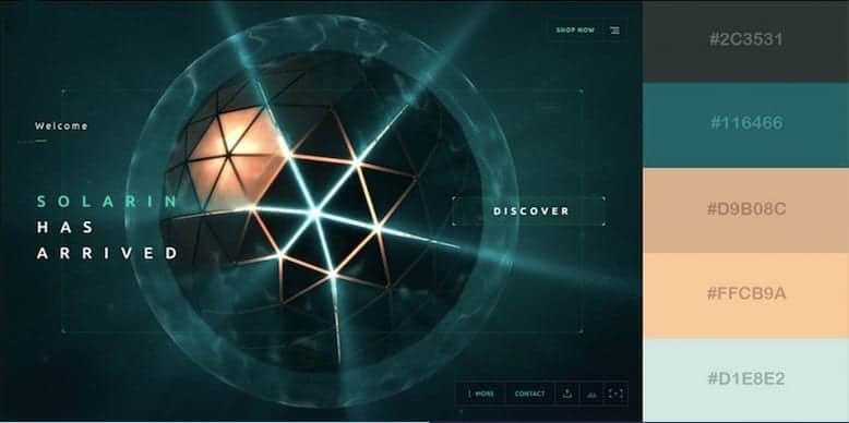
Colour Schemes within Web Design: Sleek and Futuristic
First impressions are everything and colour can often make an impression even before a shape, a word, or a spelled-out message.
While some classic colour palettes are here to stay, colour trends are no different from fashion trends, design trends – they’re fast-paced and ever-shifting.
Website colour schemes matter as they represent your values, how others see you and what they think of you can be affected by the colours you choose. At Blue Whale Media, our local web designers are mindful of the colours they are using and how they work with each other on a website to engage visitors.
Website Colour Scheme: Sleek and Futuristic
When choosing colours for your designs, be deliberate; don’t use colours without purpose. For example, sleek design means the colour scheme needs to be coordinated, but a futuristic colour scheme is innovative and engaging.
In this colour palette, there is the use of green, browns and grey; these three colours can easily represent a natural environment. Green is usually associated with eco-friendly products and services; we are now more aware of this in the current climate. It also promotes the idea of health, balance and refreshment. Brown is a warm, neutral colour that you can use as a background that conveys warmth and wholesomeness. Grey stands for neutrality; it can look subdued, classic, serious, mysterious, or mature.
To master the design, you must understand what colours look good together.
Cool Colours
Cool colours include blue, green, and purple. They usually are more muted when compared to warm tones. Shades of green adopt some features of yellow they are generally soothing and comforting yet a bit reserved. Add cool colours to your design to show a feeling of tranquillity, harmony, or professionalism.
Balancing colours
Think about the colour harmonies; you’ll begin with the dominant colour, then start to layer your palette. Darker colours tend to be seen first and carry more visual weight, then work your way back to lighter colours. Too many colours can compete and cause eye fatigue and overwhelm your website visitors. Introduce new experimental colours in small quantities to reduce risk.
Brand identity
Think about what you want your brand to stand for. You can influence a positive experience on your website by helping your visitor’s process information through thoughtful contrast. You can also establish your brand’s energy with colour vibrancy levels. They can enhance each other, make each other pop, blend together, or fight with each other.
Effectively using a colour scheme.
Planning your website colour scheme is an integral part of your marketing and conversion strategy. Your personal colour preference matters very little in this respect, just like with marketing, it’s easy to get bogged down with what you want rather than what your audience wants. Before you even embark, you should bear in mind what the primary goal of your website is and who your target audience is.
Based on your audience, your colour scheme will be different if your target audience is female than that of someone whose target audience is male, teens, or young adults.


