Logos

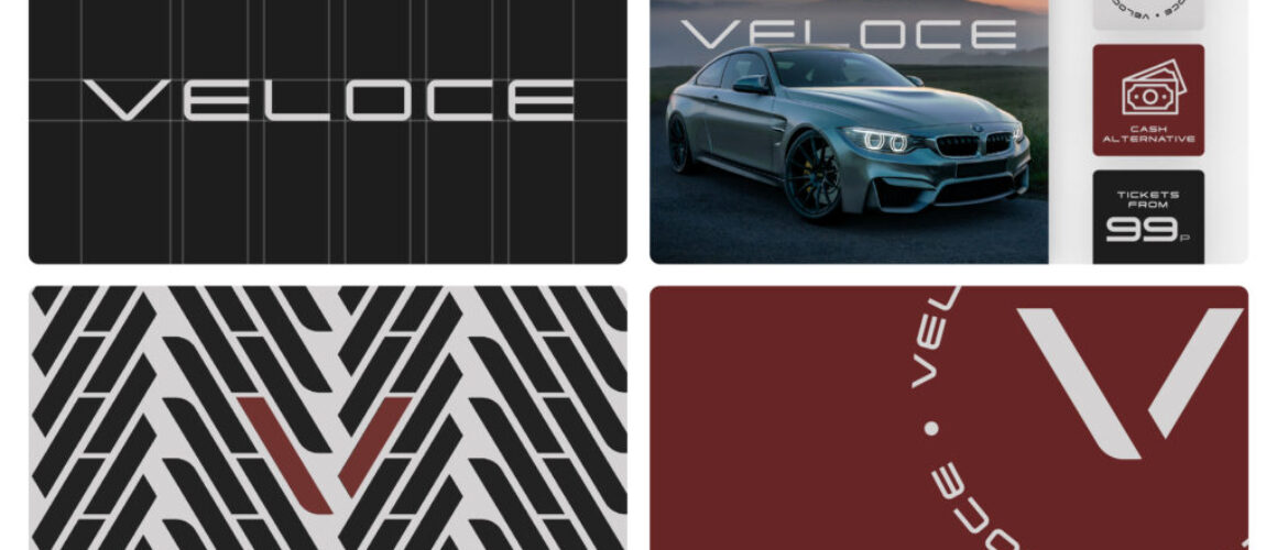
Veloce – Logo Designs
At Blue Whale Media, we pride ourselves on creating visually compelling and strategically grounded branding solutions. Our latest endeavor with Veloce Competitions showcases our commitment to excellence in design, marrying modern aesthetics with the thrilling essence of prize draws. Veloce Competitions, a dynamic and innovative company, offers participants the chance to win extraordinary prizes, from high-end automobiles to exclusive lifestyle experiences. Our mission was to encapsulate the excitement and luxury of these opportunities within their logo and broader brand identity.
Design Philosophy
The Veloce Competitions logo is a testament to modern design principles, blending simplicity with a sense of movement and excitement. Our design team embarked on a journey to distill the essence of speed, luxury, and opportunity into a logo that speaks directly to the heart of the adventurous. In a world cluttered with information and distractions, we aimed for a design that cuts through the noise, offering clarity, allure, and a promise of excitement.
Logo Design Elements
Colour Scheme: We selected a colour palette that resonates with sophistication and dynamism. The primary colours evoke a sense of luxury and excitement, reflecting the premium nature of the prizes offered.
Typography: The logo’s typography is clean and modern, ensuring readability while also conveying movement and forward momentum. It’s designed to be versatile, equally impactful on digital platforms and physical marketing materials.
Symbolism: At the heart of the Veloce Competitions logo is a symbol that captures the essence of speed and transformation. This emblem is not only a nod to the name ‘Veloce’ but also symbolizes the life-changing opportunities the competitions offer to the winners.
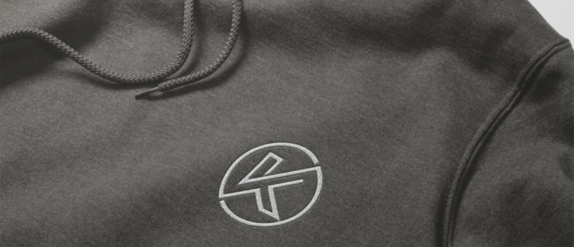
KNP Sports – Logo Design
In the dynamic world of sports apparel, where function meets fashion, KNP Sports emerges as a beacon of innovation and style. At Blue Whale Media, we had the privilege of partnering with KNP Sports to create a branding identity that not only stands out but speaks directly to the heart of athletes and sports enthusiasts alike. Central to this identity is the KNP Sports logo – a symbol of energy, durability, and cutting-edge design.
Brand Vision
KNP Sports is not just about sportswear; it’s about embracing the athlete in everyone, whether you’re hitting the gym, the track, or the streets. Their vision is to empower and inspire, to merge performance with lifestyle. This vision guided our creative process, aiming to produce a logo that encapsulates the essence of sport and the spirit of the modern athlete.
Logo Design Philosophy
Our design philosophy was rooted in three core principles: simplicity, versatility, and symbolism. The KNP Sports logo had to be more than just visually appealing; it needed to convey the brand’s essence at a glance and be adaptable across various mediums, from online platforms to physical products like hoodies, caps, and sports equipment.
Design Elements
Colour Palette: We chose a colour scheme that reflects vitality, passion, and reliability. The colours are neutral yet accessible, designed to stand out in the digital landscape and on physical products.
Typography: The typography of the KNP Sports logo is sleek and modern, with a nod to the dynamism and fluidity of sports. It’s designed to be instantly recognizable, embodying strength and agility.
Iconography: The emblem of KNP Sports is a subtle yet powerful symbol of movement and aspiration. It draws inspiration from the universal symbols of victory and progress, tailored to embody the brand’s commitment to excellence and growth in the sports domain.
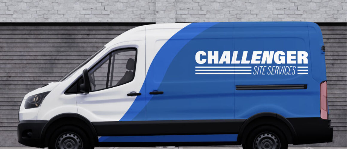
Challenger – logo
Challenger Site Services’ vision extends beyond the provision of portable toilets; they aim to revolutionise the rental experience by emphasising customer care, environmental responsibility, and innovative solutions. This vision informed our creative strategy, leading us to design a logo that communicates dependability, cleanliness, and modernity.
Logo Design Philosophy
Understanding the unique position Challenger Site Services occupies, our design philosophy was centered around differentiation, approachability, and memorability. The logo needed to stand apart in a market where customer expectations are diverse and demanding, and we focused on elements that would elevate the brand’s visibility and reputation.
Design Elements
Colour Palette: Opting for a clean and refreshing palette, we chose colours that represent cleanliness, freshness, and environmental consciousness. The chosen scheme enhances the logo’s visibility in both digital and physical formats, ensuring it captures attention in any context.
Typography: The logo’s typography reflects strength and reliability, with a clear, accessible font that speaks to Challenger’s straightforward and dependable service ethos. It’s designed to be legible at various sizes, ensuring brand consistency across all marketing materials.
Iconography: At the heart of the Challenger Site Services logo is an icon that cleverly combines the imagery of cleanliness with the mobility of their services. This emblem not only underscores the company’s specialty in portable sanitation solutions but also their commitment to delivering exceptional service standards.
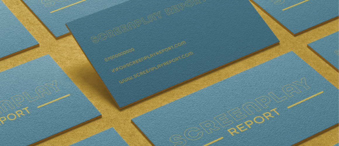
Screenplay – Logo Design
‘Screenplay Report’ envisions a world where every screenplay is given the chance to reach its fullest potential, transforming good stories into great cinematic experiences. This vision required a logo that speaks to both the analytical precision needed for script evaluation and the creative journey of writing. Our design needed to resonate with screenwriters, producers, and directors alike, embodying a blend of critique and creativity.
Logo Design Philosophy
Our design philosophy for ‘Screenplay Report’ hinged on the concepts of clarity, creativity, and transformation. The logo had to be more than an identifier; it needed to be a symbol of the screenplay’s journey from draft to screen, encapsulating the essence of storytelling and the transformative feedback that ‘Screenplay Report’ provides.
Design Elements
Colour Palette: We selected a colour scheme that suggests insight and creativity, using hues that are both engaging and professional. These colors were chosen to inspire confidence in the service’s ability to provide depth of analysis with a creative touch.
Typography: The logo’s typography strikes a balance between modernity and accessibility, reflecting ‘Screenplay Report’s’ approachable yet professional service offering. It’s designed for legibility across digital and print mediums, symbolizing the company’s adaptability in the ever-evolving film industry.
Iconography: Central to the logo is an icon that subtly combines elements of scriptwriting and analysis—such as a pen, a magnifying glass, or film reels—to convey the comprehensive nature of ‘Screenplay Report’s’ services. This symbol serves as a visual shorthand for the detailed, supportive critique that can turn scripts into stories ready for the screen.

Creatr – Logo Design
‘Creatr’ envisions a world where digital content creators, particularly those on OnlyFans, can achieve unparalleled success and recognition through strategic support and innovative marketing strategies. This vision required a logo that embodies confidence, creativity, and the transformative power of effective branding. Our design aimed to resonate across the diverse landscape of digital creators, appealing to those in various genres seeking to amplify their digital presence.
Logo Design Philosophy
Our design philosophy was centered around three key elements: visibility, connectivity, and sophistication. The ‘Creatr’ logo had to represent the agency’s role as a beacon for talent, a nexus for creator and audience engagement, and a mark of premier digital marketing prowess. It needed to be forward-thinking and adaptable, capable of standing out in the highly saturated digital environment.
Design Elements
Colour Palette: We selected a vibrant yet sophisticated colour scheme that speaks to the energy and dynamism of digital content creation. The palette is designed to attract attention while conveying the premium quality of ‘Creatr’s services.
Typography: The typography of the ‘Creatr’ logo is modern and sleek, symbolising the agency’s forward-looking approach. It’s crafted for readability and impact, ensuring the brand name is memorable and distinct across all platforms.
Iconography: Central to the logo is an emblem that encapsulates the essence of content creation and digital growth. This icon, whether abstract or literal, communicates ‘Creatr’s commitment to elevating creators, symbolizing innovation, and the upward trajectory of the models it supports.
Ranger Fire Security – Logo Design
Ranger Fire Security envisions a world where communities and businesses operate with the utmost safety against the threat of fire. Their dedication to this cause required a logo that communicates strength, trust, and the advanced nature of their services. The challenge was to distill these concepts into a visual form that is both memorable and emblematic of the brand’s leadership in fire security services.
Logo Design Philosophy
Our approach was anchored in creating a symbol of safety and assurance. The logo needed to resonate with a wide audience—from residential to commercial clients—while reflecting Ranger Fire Security’s industry-leading standards and innovative solutions. The design philosophy centered on simplicity, recognisability, and the conveyance of expertise.
Design Elements
Colour Palette: We opted for a colour scheme that exudes strength and alertness, incorporating hues traditionally associated with fire security, such as red and orange, complemented by the stability of blue or grey to signify professionalism and reliability.
Typography: The chosen typography for Ranger Fire Security’s logo is robust and straightforward, ensuring legibility and instilling confidence. The font reflects the company’s no-nonsense approach to fire safety and their commitment to delivering un-compromised service.
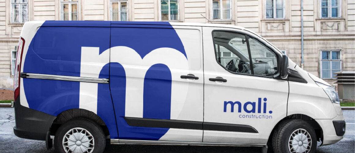
Mali Construction – Logo Portfolio
Mali Construction is driven by a vision to redefine the standards of home renovation, focusing on the heart of the home: the kitchen and bathroom. Their aspiration to deliver not just renovations but transformations required a logo that speaks to the meticulous attention to detail, innovation, and personalised service they offer. It was essential that the logo reflects the company’s philosophy of blending functionality with style, ensuring that every project is a true reflection of the client’s vision.
Logo Design Philosophy
The logo design philosophy was anchored in elegance, precision, and adaptability. It needed to resonate with homeowners looking for bespoke renovation solutions that reflect their personal style while embodying the technical prowess and design sensibility of Mali Construction. The design approach focused on creating a logo that is both timeless and indicative of the company’s forward-thinking ethos.
Design Elements
Colour Palette: The colour scheme was carefully selected to evoke a sense of sophistication and cleanliness, essential qualities for kitchen and bathroom spaces. Neutral tones, accented with hints of more vibrant colours, were chosen to convey the wide range of possibilities Mali Construction brings to their projects.
Typography: The typography of the Mali Construction logo is sleek and modern, reflecting the company’s commitment to contemporary design while ensuring legibility and a professional appearance across various mediums.
Iconography: The logo incorporates subtle references to the core of Mali Construction’s services.
Step 2 Mediation – Designs
Step2Mediation – Modernised Mediation Services
Step2Mediation is a specialised firm providing mediation services for Civil and Commercial, Interpersonal, and Family matters. With a steadfast dedication to facilitating peaceful resolutions, Step2Mediation offers personalised mediation solutions tailored to the unique needs of each client.
Blue Whale Media collaborated closely with Step2Mediation to create a website that reflects the firm’s commitment to constructive dialogue and resolution. We introduced a refreshed look featuring vibrant colours, symbolising positivity in the mediation process and to add vibrancy to the site while maintaining a professional aesthetic, ensuring Step2Mediation stands out in the field.


