
Challenger – Stationary
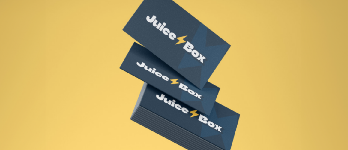
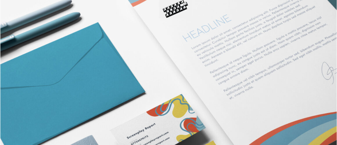
The stationary design crafted for Challenger exudes practicality and modernity in equal measure. The design incorporates sleek lines and a vibrant colour palette to capture attention without compromising functionality. The company logo, prominently displayed, serves as a beacon of reliability and quality, reinforcing trust in every use.
These designs were created with accessibility in mind and aligned with the company’s commitment to sustainability. In essence, the stationary design represents a harmonious blend of form, function, and sustainability, setting a new standard for portable sanitation solutions.
Creatr – Stationary
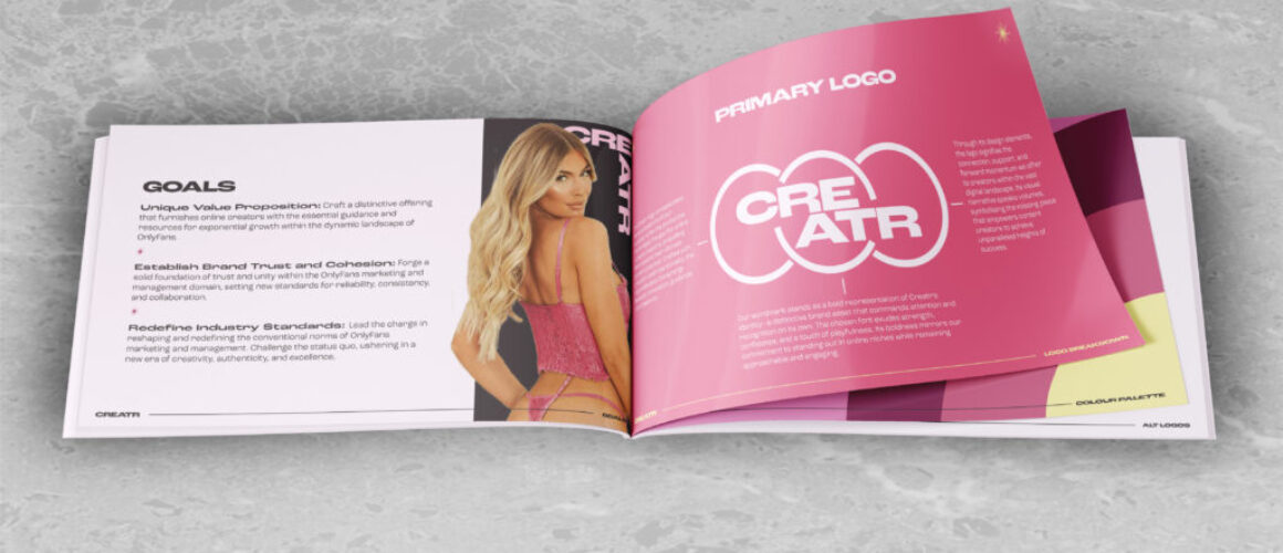
The stationary design for Creatr pulsates with energy and creativity, mirroring the dynamic essence of its brand. Bursting with bold hues and captivating graphics, every detail is meticulously crafted to engage and entice. The designs evoke a sense of excitement and allure that resonates with the agency’s diverse community of content creators and subscribers.
Each piece of stationary serves not only as a representation of the agency’s vibrant persona but also as a gateway to a virtual realm where fantasies come to life. In essence, the stationary design captures the essence of the OnlyFans agency, serving as a captivating portal to a world where expression knows no bounds.
Floret – Graves in Bloom (Brand Creation)
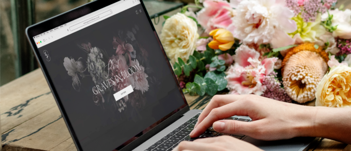
At Blue Whale Media, we take pride in crafting compelling branding solutions that breathe life into businesses and elevate their presence in the market. Our latest collaboration with Floret – Graves in Bloom, a subscription service dedicated to honouring the memories of loved ones by delivering fresh flowers to their graves, epitomises our commitment to innovation and empathy-driven branding.
Project Overview:
Floret – Graves in Bloom approached us with a unique vision: to offer a heartfelt service that celebrates the lives of departed loved ones through the beauty of flowers. Understanding the delicate nature of their mission, we embarked on a journey to create a brand identity that resonates with empathy, reverence, and comfort.
Branding Concept:
Drawing inspiration from the serene tranquility of a blossoming garden, our concept for Floret – Graves in Bloom encapsulates both the ephemeral beauty of life and the timeless depths of memory.
Visual Identity:
Incorporating soothing hues and pristine white, our visual identity evokes a sense of serenity and purity. The logo, featuring graceful and delicate flowers symbolises protection, nurturing, and eternal remembrance. The elegant typography exudes warmth and sophistication, inviting customers to embark on a journey of solace and reflection.
Brand Elements:
Every aspect of the brand, from packaging design to digital assets, embodies the ethos of compassion and care. Soft, ethereal imagery of blooming florals grace the packaging, creating a sensory experience that uplifts and consoles. Thoughtfully curated social media content fosters a supportive community where shared memories flourish and bonds endure.
Messaging Strategy:
Our messaging strategy revolves around the core values of empathy, remembrance, and celebration. Through heartfelt storytelling and poignant testimonials, we honour the memories of loved ones while highlighting the transformative power of floral tributes in fostering healing and connection.
Outcome:
The culmination of our efforts is a brand that not only resonates with its target audience but also serves as a beacon of hope and solace in times of grief. Floret – Graves in Bloom stands as a testament to the enduring power of love and remembrance, enriching lives and touching hearts with every bloom.
Conclusion:
At Blue Whale Media, we are honoured to have collaborated with Floret – Graves in Bloom in bringing their vision to life. Together, we have created a brand that transcends mere transactions, offering solace, comfort, and enduring connection to those who seek solace in the beauty of remembrance.
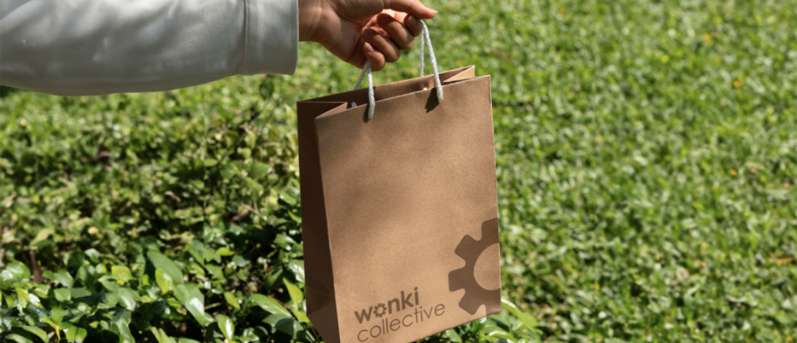
ICL – The Wonki Collective (Brand Creation)
At Blue Whale Media, we are passionate about partnering with visionary brands that are committed to making a positive impact on the world. Our collaboration with The Wonki Collective, a revolutionary initiative dedicated to the redistribution of food supply chain ingredients, exemplifies our shared dedication to innovation, sustainability, and social responsibility.
Project Overview:
The Wonki Collective approached us with a bold mission: to transform the food industry by creating a more equitable and sustainable supply chain. With the aim of reducing waste and promoting fair access to high-quality ingredients, we embarked on a journey to craft a brand identity that embodies the spirit of inclusivity, resilience, and culinary creativity.
Branding Concept:
Inspired by the vibrant diversity of global cuisines and the dynamic interconnectivity of ecosystems, our concept for The Wonki Collective celebrates the beauty of imperfection and the power of collaboration. Embracing the notion that every ingredient has a story to tell, we sought to create a brand narrative that champions the unique character and value of each component within the supply chain.
Visual Identity:
Our visual identity reflects the eclectic energy and organic fluidity of The Wonki Collective’s ethos. Bold, playful colors and dynamic patterns evoke a sense of excitement and possibility, mirroring the eclectic tapestry of flavors and cultures represented in the brand’s offerings.
Brand Elements:
From packaging design to digital assets, every brand element is infused with the spirit of sustainability and community. Recyclable materials and eco-friendly printing techniques underscore The Wonki Collective’s commitment to environmental stewardship, while immersive storytelling and interactive content foster a sense of connection and engagement among customers and stakeholders alike.
Outcome:
The result of our collaboration is a brand that not only disrupts the status quo but also fosters a sense of community, creativity, and shared purpose. The Wonki Collective stands as a beacon of hope and possibility in a world hungry for change, offering a fresh perspective on the power of collaboration and conscious consumption to transform lives and communities for the better.
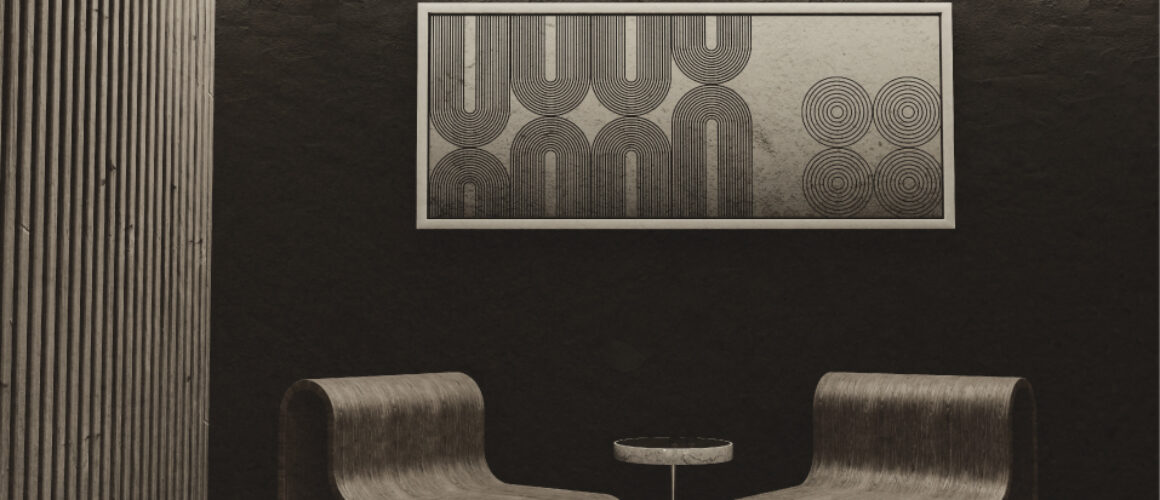
ICL – Cresco
Blue Whale Media is thrilled to present the branding portfolio for Cresco, an innovative sustainable construction company that stands at the forefront of the environmental revolution in the construction industry. Cresco is committed to transforming construction practices by minimising waste and maximising sustainability, driven by the groundbreaking application of biotechnology materials.
Brand Identity
The essence of Cresco’s brand identity is encapsulated in its dedication to eco-friendly construction practices that do not compromise on quality and efficiency. Our branding strategy for Cresco revolves around three core elements: innovation, sustainability, and resilience. The visual identity, including the logo, colour palette, and typography, reflects Cresco’s commitment to the environment and its pioneering role in the industry.
Logo: The Cresco logo combines abstract lines and shapes symbolising the seamless integration of construction and biotechnology.
Colour Palette: A soothing yet vibrant blend of earth tones and nuetrals, reflecting Cresco’s commitment to the planet and highlighting its innovative use of biotechnology materials.
Typography: We chose a clean, modern font that speaks to Cresco’s forward-thinking approach and its reliability in the construction sector.
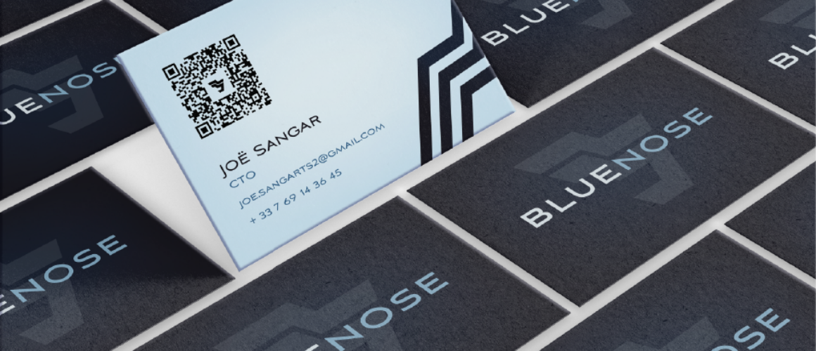
BlueNose Stationary
The sustainable stationary design tailored for the maritime industry embodies a harmonious fusion of innovation and environmental stewardship. With a focus on scalability and retrofitting compatibility, the design presents a transformative solution poised to revolutionise fleets across Europe and beyond.
The stationary design stands as a testament to the industry’s collective commitment to sustainable practices, providing a platform for showcasing leadership and driving positive change on a global scale. In essence, the design represents a pivotal step towards a future where maritime transportation is not only efficient and profitable but also in harmony with the delicate ecosystems it traverses.
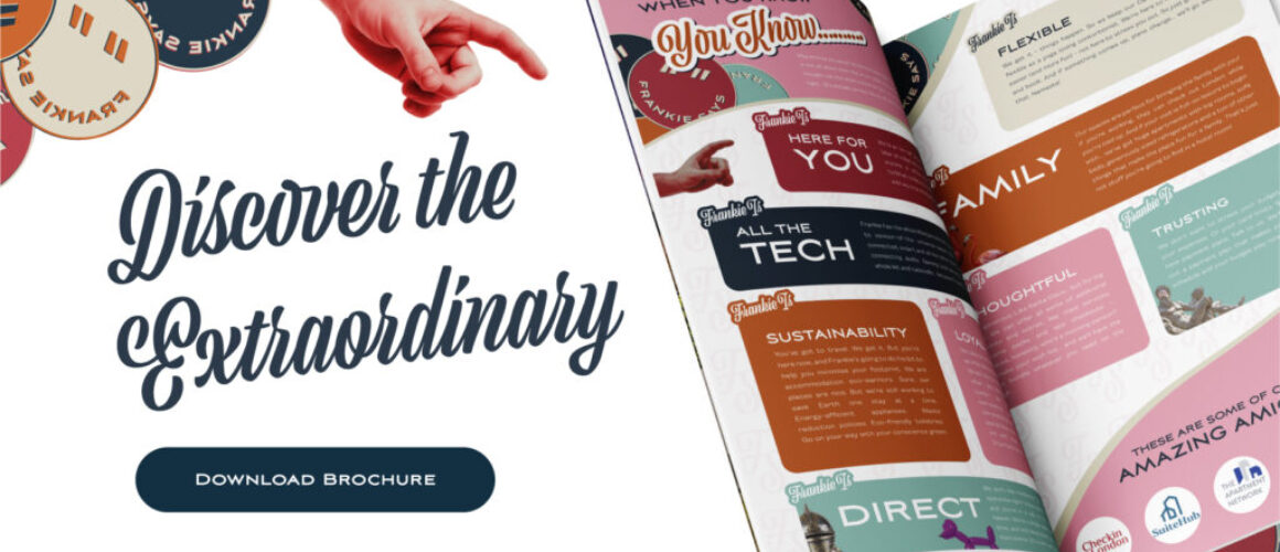
Frankie Says Brochure 3
The leaflet design for Frankie Says, exudes sophistication and charm, mirroring the vibrant energy of London itself. Infused with style and character, each piece of stationary embodies the essence of London living, featuring bespoke designs and luxurious details that invite guests to immerse themselves in a world of comfort and indulgence.
Furthermore, the leaflet design reflects Frankie Says’ commitment to providing unparalleled flexibility and convenience to its guests. In essence, the design captures the essence of Frankie Says’ ethos – to offer a haven of comfort and style in the heart of central London, where every moment is an opportunity to create lasting memories.
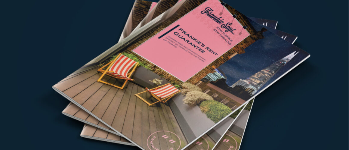
Frankie Says – Brochure
Frankie Says entrusted us with the task of redesigning their website, creating a series of captivating brochures, and refreshing their brand identity. Our objective was clear: to showcase Frankie Says’ bold personality and their commitment to offering holiday makers unique short-term accommodations in sought-after London locales. In our collaboration with Frankie Says, we delved deep into their brand ethos, extracting the essence of what makes them stand out in the hospitality industry. Through innovative design elements and compelling storytelling, we crafted a digital and print experience that encapsulates the excitement and allure of staying with Frankie Says.


